
Meguiar’s
–

Website Redesign
–
Meguiar’s is possibly the first car care products company, being around since 1901. With hundreds of products across two websites, they needed a refresh of their corporate website. Since their e-commerce website, Meguiar’s Direct, did the actual job of selling the products, this brand website needed to function like and e-com site, but be more showy and on-brand. Large imagery that featured the details of the car - texture, shine, etc… not only made for a more “sensual” site but underscored the purpose of the products and the car fanatics that use them; Details matter.
Analytics & Information Architecture
–

Metrics-Based Architecture
–
First, extensive analytics of meguiars.com was investigated to determine high traffic pages and entry points / methods. Then a comprehensive sitemap was developed organizing the types of pages, their function and flow, and their basic content.
Wireframing
–

Low-fidelity wireframes were created to determine content, flow, feel, and usability for each page

Homepage
–
The main purpose of the homepage was to give a sense of the brand - dark, masculine, elegant, while retaining the colors from the logo without feeling like we’ve lost the gravitas of the brand equity. But coming in a very close second was to get people to use the “Product Advisor”.
Mequiar’s is a leader in creating the right project for the right job - for both regular car buffs as well as professional detailers. Their customer service spends a lot of time helping people find the right product, so the Product Advisor was developed to help get people to a product (or assortment of products) that are right for the specific task.
–
(play with a fully functional Product Advisor prototype on the mobile comp)

Search Result / Category
–
The SRP template had to function for more purposes than any other page. It was the Search Results, the Product Finder multi-product results, the Category (automotive, professional, and marine) as well as Collections (a merchandised family of interrelated products)
A new, consolidated filter set was created, cleaning up hundreds of conflicting, superfluous, or duplicate product tags. These were created for the specific needs of every category.
The bullet point copy was redone and cleaned up as it was often confusing and redundant.
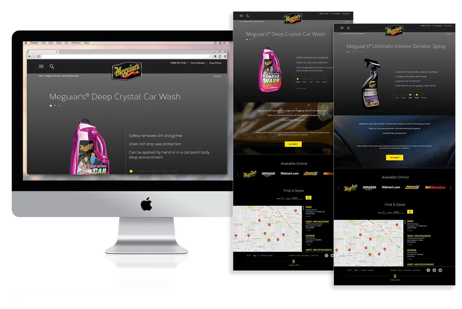
Product Details Page
–
Since the separate e-com site dealt with the nitty gritty of purchase and conversion, the client wanted these product pages to have an emotional sense to them with large product images and clean, clear information.
A unique and easy-to-identify system was added showing the consumer exactly what step of the process this product is for: Clean, Restore, Shine, Protect, Maintain. This allows the customer to know at a glance what to use the product for.


Prototyping
–
Fully working prototypes were build in all sizes in InVision for every design round to get a sense of how the site would flow. This became especially important with respect to polishing the Product Advisor.