
Preferred Hotels & Resorts
–

Website Redesign
Preferred Hotels needed a complete website redesign including a total reworking of their checkout process. It was important to make it work on web as well as mobile, as the rate of mobile adoption in hospitality is steadily on the rise. We began with research and insight into their existing consumer base, as well as trend research into hospitality successes across the industry. Information architecture was prioritized according to an audit of most common SEO entry points, top keyword searches, and commerce metrics like “Cart Abandon Points”.
ACHIEVED
Average Order Value: Up 10%
Mobile Usability: Up 83%
Traffic: Up 33%
Cart Abandonment: Down 25%
UI Design
–


Homepage
–
The homepage was designed to be engaging and intelligent. It is modular with units comprising 4-column, 8-column, and 12-column. The 4 & 8-column modules fit exactly into the tablet layout without any reconfiguring, allowing the modules to dynamically adjust more easily, and re-stack themselves on window resizing. The first 8 rows of modules are able to be set by merchandisers, with positions monetized, while the subsequent rows are auto-generated based on set criteria (popularity, purchase history, location, etc…)
95% of hospitality website users immediately go to the search function first, so that was placed front and center. When the page is scrolled, the nav collapses into a simple persistent search bar.
UI Design
–


Property Details Page
–
The most frequently entered page, via SEO, is the property page. Originally, there was little engagement as the copy was lengthy and difficult to read, and the various sections were split up into 5 different URLs per page. For the redesign, the copy was completely rewritten for clarity & scalability, and the page was consolidated into one URL with the remaining set up with SEO redirects.
This long page was more easily managed via a left-hand icon jump menu.
Additionally, room and offer information was brought forward rather than hidden behind a GDS click which sent you to a non-Preferred Hotels page.


An entire set of custom icons for amenities and features was created in the new, clean style reflected on the rest of the site UI
Checkout
–
The checkout process needed to be completely redesigned. It was simplified to four steps. There were many restrictions as to what could and could not be done, as the system is powered by SABRE (the Global Distribution System) and SynXis (the Global Reservation System) and is neither hosted nor controlled by Preferred Hotels & Resorts. Research showed that once in the checkout flow, removing the main nav items reduced “ADHD Bounce” and increased conversions by keeping consumers in the flow. The redesign was made to be clear, easy to use, and inspire trust.
Step 1: Date select - makes GRS call for specific rates & availabilities
Step 2: Choose Room / Offer (rate code)
Step 3: Traveler & Payment Information
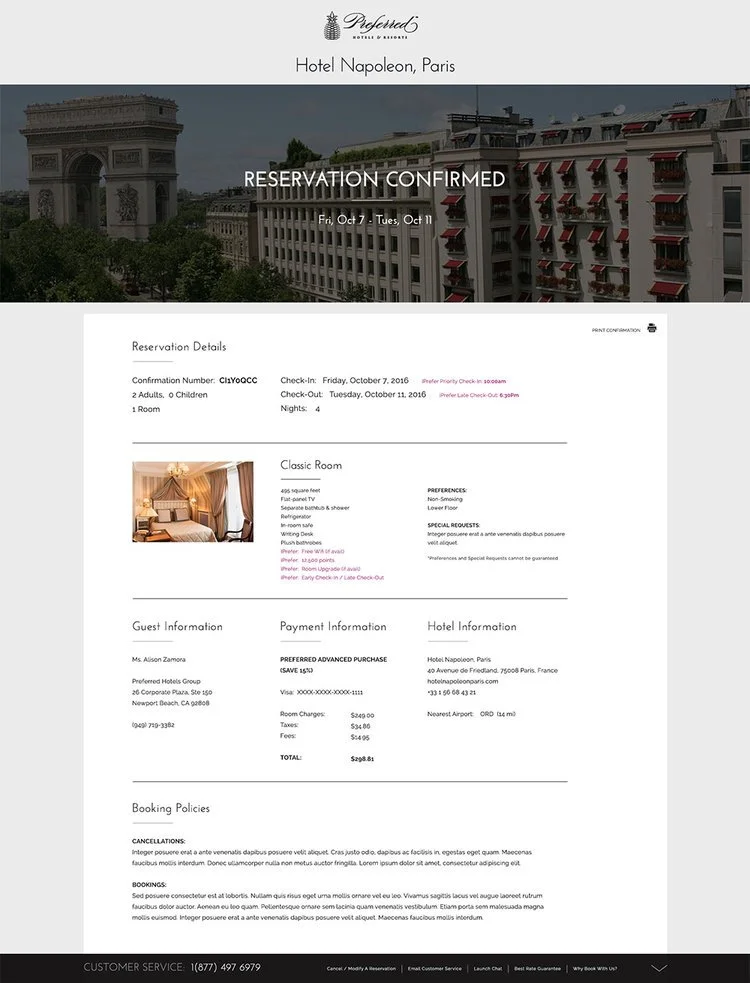
Step 4: Confirmation
Prototyping
–
View the InVision Prototypes here
MOTION PROTOTYPING
–
Multiple, interactive, clickable prototypes were created with motion to better convey the intended feel of the site; A preference, and a simplified alternative.