
Capturing the Feel
Warner Music Group / Rhino Entertainment

SECTOR: Music & Entertainment
OBJECTIVE: Honor the legacy of the music catalogue by capturing the feeling of publications and record stores, with music aficionados in mind
OUTCOME: Conversion rate up 700%, Revenue up 300%, Net Margin up 200%, AOV up 150%, Acquisition up 500%, Cart Abandonment down 40%, Customer service inquiries down 20%
MY ROLE: As Creative Director at Rhino, I led the design process and team, as well as producing much of the work myself.

Taking Rhino - the largest catalogue label in the world into the digital age was a monumental task. Known for its complex box sets and deep cuts, it needed a direct-to-consumer commerce website that not only exemplified their brand but also facilitated a very complex, multi-codec digital download system.
More importantly, it had to pay homage to the disappearing physical music era, (for which Rhino is famous.)
User Personas & Wireframes
–
Rhino is FAMOUS for their products - complex and limited edition box sets with never-before-seen/heard content in multiple formats. It was important to understand WHO the Rhino shopper was. Personas were created for varying degrees of fandom: from the “Casual Fan” to “The Collector” to the “The Completist” with tactics for each. Since each had different things they were looking for, different areas of the pages were designed to speak to different parts of the audience.


The heart of the website (and most complex aspect) was the multicodec, digital download functionality. No one else at the time was offering multiple codecs of digital download, which complicated things exponentially.
Box sets often had multiple discs, a DVD, and a booklet. Plus they had to be sold in three codecs; MP3 for the “Casual” fan, and High Definition (FLAC & WMA) for the “Completist”.
UI Design
–


Inspiration was taken from music “rags”, post-punk xerox posters, music store notice boards, and tabs from crate-digging to synthesize an experience that would be wholly digital but familiar to the seasoned music aficionado.
Graphic exploration in the form of ads, social media units and merchandising modules allowed for the sheer diversity of styles one might find in a music store. Each was inspired by the synesthetic interpretation of the music itself. From archival photography to custom artwork, no two were alike and it allowed us to hone in on a visual language that was diverse yet unified.


Homepage
–
Paying homage to notice boards at famous music shops like Amoeba Records and Tower Records, the homepage aggregated content and was headed by an animated, modular hero graphic area that spun (echoing the feel of flipping through record bins)
A: Search - the first thing 92% of users do
B: Subnav with login, links to account pages and cart
C: Internal advertising
D: Animated Primary Focus Area. This item split the graphic up into columns and flipped them to transition between slides. Motions like this were deliberately used to evoke actions of “crate digging” and music shopping in music stores (important for Completists and music-lovers in a world where physical album stores are disappearing)
E: Podcast and News/Article sections, with advertising
F: New and Upcoming releases. Icons denote what formats the items will be coming in.
G: User tools. Checking order status considerably reduced customer service calls (saving lots of money)
H: Cross promotion
I: Promoting Rhino’s sub-brand, “Rhino Handmade” which sold high-end, very limited edition items usually consisting of deep cuts or live performances of note with producer commentary and liner notes.
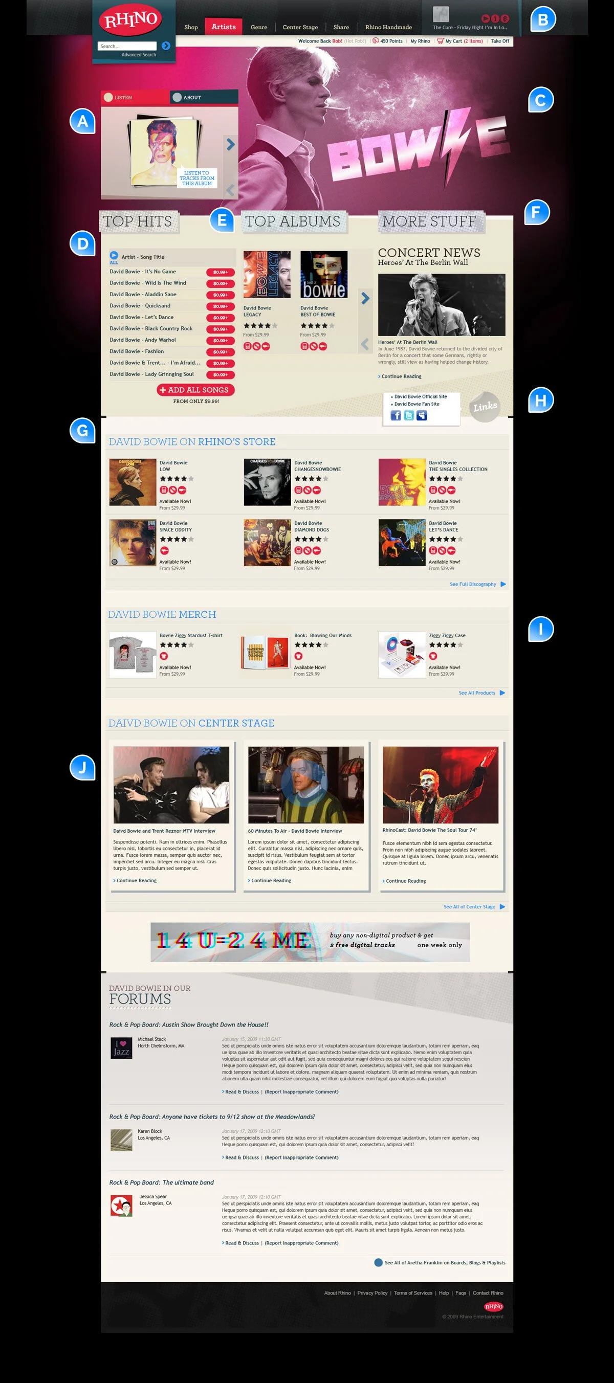
Artist Page
–
Artist Pages were one of the most important entry points. Each one had hand-crafted graphics.
The large background graphic was instrumental in creating an immersive feel specific to the artist.
A: Albums on Rhino Radio (see B) These are scrollable.
B: Radio Player. A mini radio player lived in the main nav streaming whatever you liked (within Rhino’s catalogue)
C: Custom artist PFA
D: Top songs - purchasable from the page itself
E: Top Albums
F: Promotional area for articles or news
G: Albums on sale showing what formats they are available on
H: Outlinks to artist’s independant websites
I: Unique Merchandise created and sold by Rhino’s in-house team
J: Center Stage was the editorial side to Rhino, with articles and historic videos of note.

Product Page
–
The Product Page was the most common entrance to the site and most complex page, requiring heavy amounts of information as well as varying levels of product type - both physical and digital. The placement of every element was heavily user-tested and iterated.
A: Product information. We created an automated method where the system itself composited key art into CD, Vinyl, and Digital product shots for easy production
B: Format tabs. Clicking Vinyl or Digital would change the product information - including track listings as often, the tracks would be slightly different (for example, tracks on vinyl are often lengthened or shortened - or entirely new songs produced in order to even out play lengths on both sides)
C: Producer Video. One of the unique things about Rhino was that they were in on the creation of the products, or management of the band from the beginning and had insights and stories you couldn’t find anywhere else.
D: Incentive placed near the CTA increased conversion
E: Download Player & Track List (See below)
F: Acquisition and Content cross promotion
G: Recommendations. Rhino and User lists
H: Reviews. Having a very loyal customer base of music fanatics, meant customers were very thorough in UGC
Checkout
–
We designed a streamlined commerce funnel that accommodated incredibly complex purchases that increased Conversion by 700% and reduced Abandon Rate by 40%


A cart that could simultaneously handle shipped items, download items, notifications, and cross promotions - for Guest and Registered users
Based on cart contents, additional products were recommended in the right column. Users could inspect and add them right there without interrupting the flow
Summary
–
for Rhino’s foray into the Direct–to-Consumer space, it was a massive success, achieving record numbers including:
Conversion rate up 700%
Revenue up 300%
Net Margin up 200%
AOV up 150%
Go-To-Market Efficiency up 300%
Acquisition up 500%
Cart Abandonment down 40%
Customer service inquiries down 20%
Unfortunately the site was sunsetted in 2014 as part of Rhino’s redirection away from Direct-to-Consumer and focusing on Sync & Licensing (which is more self-sustaining with less overhead and maintenance.)