When we design for the web, the industry standard is often "conversion at all costs." We build for the click, the lead, and the sale. But my recent experience designing a landing page for a rehabilitation center forced a shift in that perspective. When a user arrives at a site like that, they aren't a consumer in a shopping mood, they are a human being in a state of profound vulnerability.
Whether they are seeking addiction treatment, crisis counseling, or medical support, these users are often operating with a fractured focus and a heightened "fight or flight" response. In these moments, our design choices can either act as a barrier or a bridge to healing. To build that bridge, we have to move beyond aesthetics and into the psychology of safety.
The Language of Typography: Warmth vs. Authority
The "voice" of a website is often dictated by its casing. While Title Case (where every word is capitalized) can feel confident and authoritative in a corporate deck, it can come across as cold or even aggressive to someone in a fragile state. Research in UX design and marketing consistently shows that sentence case is perceived as more approachable, conversational, and "softer."
Lowercase letters and sentence case lead users to perceive a brand as having more warmth and friendliness. Conversely, all-caps or title case can trigger perceptions of dominance and rigid authority. This isn't just a design "hunch"; major tech leaders like Google and Microsoft have shifted their design guidelines (Material Design and Fluent Design) toward sentence case specifically to appear more human-centric. In fact, a survey by Silver Pistol found that 83.7% of people preferred sentence case for subheadings and body elements because it felt less formal and significantly easier to digest. For someone whose cognitive bandwidth is already stretched thin, that ease of digestion is an act of empathy.
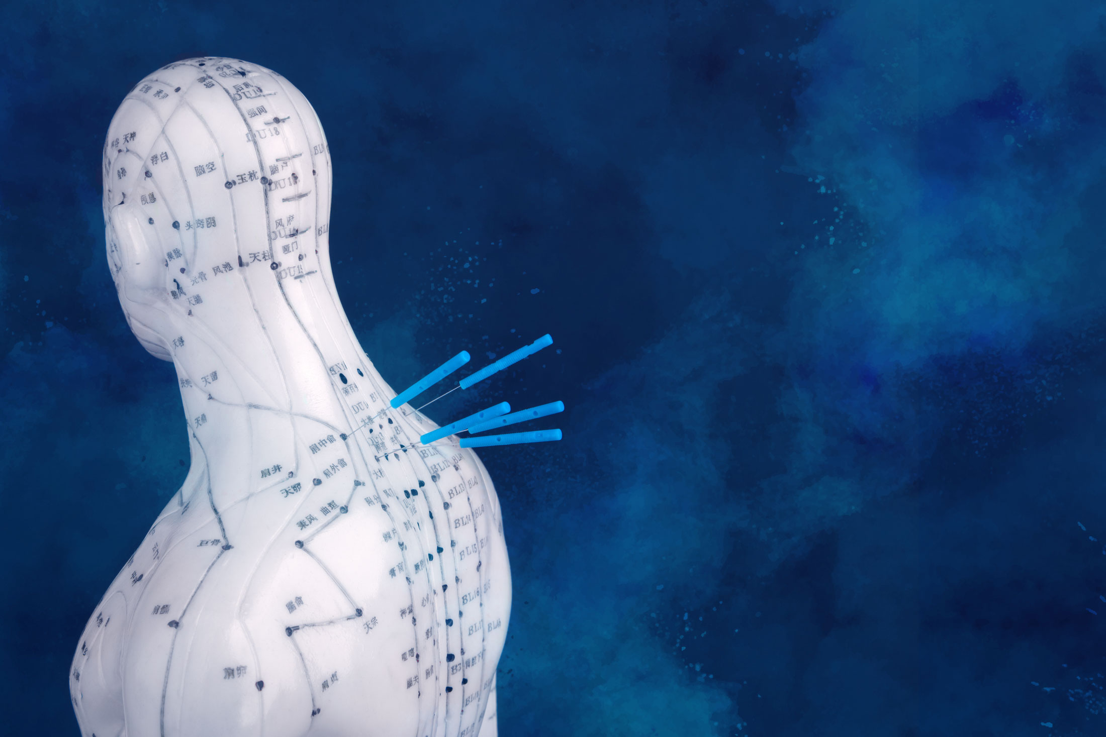
The Physiology of Color: Why Blue and Soft Tones Matter
Color choice is where we can most effectively lower a user’s cortisol levels. While a brand might have a color like taupe in its logo, I advocate for a softer, monochromatic palette—specifically leaning into blues and muted tones—for very specific physiological reasons.
Blue is the dominant color in healthcare, used by over 80% of leading companies, and it’s not just because it looks "clean." In the "Warmth vs. Competence" framework, blue is the primary driver of perceived reliability. When a vulnerable user asks, "Will this work?" or "Can I trust these people?", blue signals that the institution is established and professional.
Beyond psychology, there is a physical response: research shows that exposure to blue light and pigment can actually lower blood pressure and heart rate. In the context of addiction treatment, where visitors are often experiencing intense anxiety, this visual "de-escalation" is vital. Furthermore, cool tones are cross-culturally associated with hygiene and "clear skies," which helps psychologically counter the feelings of "messiness" or shame often associated with the struggle of recovery.
Lowering the Cognitive Load
People in crisis suffer from reduced "cognitive bandwidth." High-contrast, "noisy" colors or complex layouts require mental energy that these users simply don't have to spare. By using a soft, monochromatic blue scheme, we provide "visual quiet." This allows the user to focus entirely on the content—how to get help—rather than fighting with a loud or distracting UI.
A 2021 study on "Compassionate Design" found that muted, light-filled palettes transform a website from a marketing tool into a digital sanctuary. This shift reduces the user's stress response, making them feel safe enough to stay on the page, read the information, and ultimately take the brave step of completing a contact form.
Designing the "Invisible" Support System
Beyond the visuals, empathy must be baked into the functionality. When someone is overwhelmed, the "standard" way of doing things can feel like a mountain. We should consider:
- Radical Form Simplification: Don't interrogate. Use one question at a time and only ask for what is strictly necessary. A long, complex form can feel like a final straw for someone on the edge.
- Predictable Navigation: This is not the time for "creative" menus. The "Contact" button should be exactly where they expect it to be. Surprise is the enemy of a vulnerable user; predictability is their friend.
- Supportive Error Messages: Instead of a harsh red "Invalid Input," use soft tones and helpful language like, "It looks like a digit might be missing—could you double-check that for us?"
Designing for vulnerability is, at its core, a practice of digital compassion. It’s a reminder that we aren't just moving pixels; we are holding space for someone during one of the hardest moments of their life. By softening our tones, simplifying our language, and prioritizing the user's peace of mind, we create a space where healing can actually begin.
––––––––
Beyond the visual aesthetics of typography and color, designing for vulnerability requires looking at the "invisible" architecture of a website –the way it functions and how it respects the user's mental bandwidth and privacy. When someone is in a state of crisis or deep vulnerability, their cognitive load is usually at its limit. They don't have the "brain space" for complex decision-making or technical friction.
This can include scenarios like:
• It's late and you're checking into a hotel
• You're frazzled and arriving at an airport and need guidance or a boarding pass fast
• Emergency roadside assistance
• Checking a health portal or navigating a hospital website.
There are many instances where someone might be in an anxious or fragile state of mind and need help. Here are several other critical layers to consider for a truly empathetic design:
1. The "Quick Exit" and Privacy Safety
For users in certain vulnerable states—such as those seeking help for domestic transparency or exploring sensitive health issues—the fear of being "caught" browsing can be a massive source of anxiety.
Implementing a prominent, sticky "Quick Exit" button that immediately redirects the browser to a neutral site (like Google or a weather report) can provide a literal lifeline of safety. Beyond that, being transparent about data privacy is essential. Instead of a 20-page legal document, use a simple "Your Privacy Here" callout that explains in plain English that their history isn't being tracked or how to browse in incognito mode. This builds a foundation of physical and digital safety.
2. Radical Simplification of Forms
Forms are often the most stressful part of a website. For a vulnerable user, a long list of required fields can feel like an interrogation.
- Progressive Disclosure: Don't show twenty questions at once. Show one at a time so the user can focus on a single task.
- Optionality: Clearly mark what is actually necessary. If you don't need their middle name or how they heard about you right this second, don't ask for it.
- Save for Later: If it’s a long intake form, allow them to save their progress. Someone in a crisis might get interrupted or emotionally overwhelmed and need to step away.
3. Avoiding "Dark Patterns" and Pressure Tactics
In standard e-commerce, we see "Only 2 spots left!" or "5 people are looking at this right now." In a design for vulnerability, these tactics are predatory.
Anything that creates a sense of artificial urgency or FOMO (Fear Of Missing Out) can trigger a panic response in someone already on edge. Empathic design removes the "hustle." It replaces "Call Now!" with "We are here whenever you’re ready to talk." It’s about offering an open door rather than a high-pressure sales pitch.
4. Humanizing the "Error" State
We’ve all seen the aggressive red text and "Invalid Input" messages when we mess up a form. To a vulnerable user, this can feel like a personal failure or a technical wall.
Redesign your error messages to be supportive assistants rather than digital hall monitors. Instead of "Invalid Phone Number," try "It looks like a digit might be missing—could you double-check that for us?" Use soft yellow or blue icons for warnings instead of harsh red "X" marks. The goal is to keep the user moving forward without making them feel frustrated.
5. Accessibility as Empathy
Vulnerability often comes with physical or cognitive symptoms—shaking hands, blurred vision from crying or fatigue, or an inability to focus.
- Large Touch Targets: Make buttons big and easy to click for someone whose motor skills might be compromised by stress.
- High Readability: Ensure the contrast ratio is high enough that someone with tired eyes can read it effortlessly, but keep the background "off-white" or "soft cream" to prevent screen glare.
- Audio and Text Alternatives: Some people might find it easier to listen to a message than to read it when they are overwhelmed. Providing a simple audio version of key information can be a huge relief.
6. Predictable Navigation
When we’re stressed, our spatial awareness and memory take a hit. A "creative" or "experimental" menu that hides links behind "hamburger" icons or requires hover effects can be infuriating.
Keep your navigation "boring" and predictable. The "Home" link should be on the top left, and "Contact" should be on the top right. Use breadcrumbs so the user always knows exactly where they are in the site's ecosystem. This sense of orientation provides a subtle feeling of being grounded.