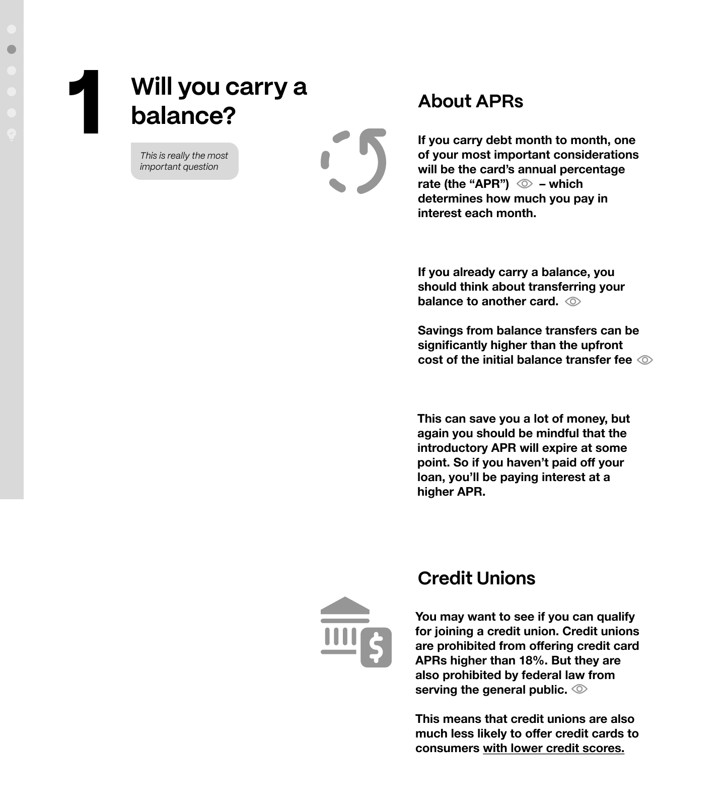
Designing the user experience for Credit Card Confidence presented a unique challenge: transforming inherently dry and dense credit information into an engaging and digestible narrative. The core strategy revolved around a "scrollytelling" approach, leveraging the power of linear storytelling to guide users through complex concepts. Instead of traditional static pages, wireframes and storyboards were meticulously crafted to visualize a dynamic flow, where each scroll action progressively revealed new layers of information, visuals, and interactive elements, effectively turning a typically mundane topic into a compelling, fresh, and fun journey of discovery.
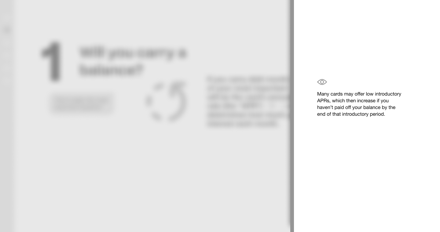
The user experience was meticulously designed to empower agency without overwhelming. While the primary path was a carefully curated narrative, provisions were made for users to "dive deeper" into supporting content through subtle expandable sections or contextual pop-ups, and even link out to external resources for further exploration. This layered approach ensured that the site catered to both casual learners seeking a quick overview and more curious individuals desiring comprehensive detail, all within a seamlessly integrated and visually appealing interface that defied the typical perception of financial education.


