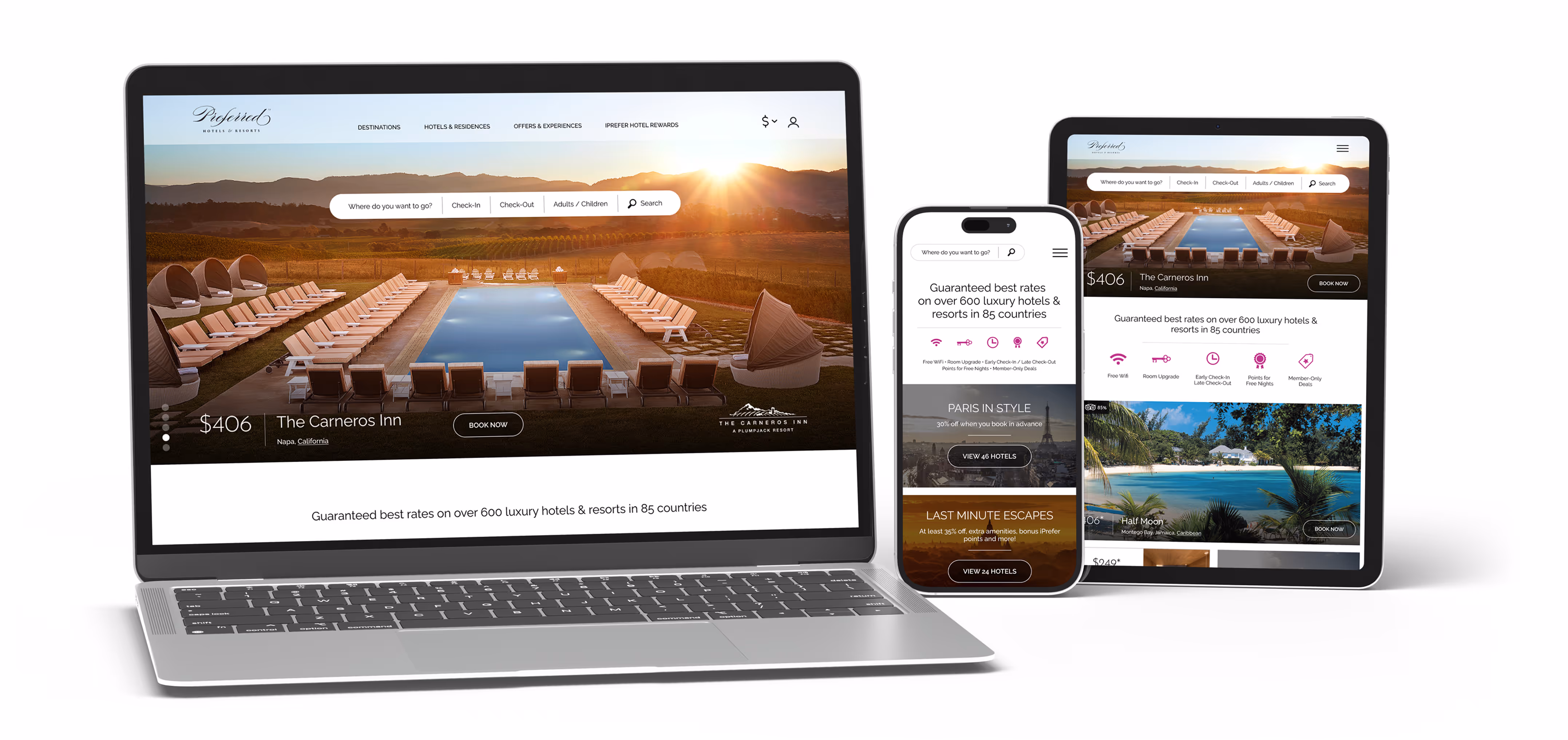
Preferred Hotel Group
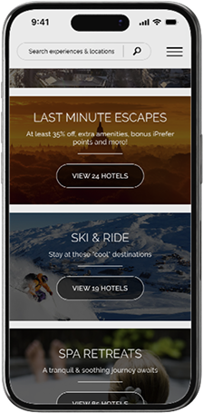
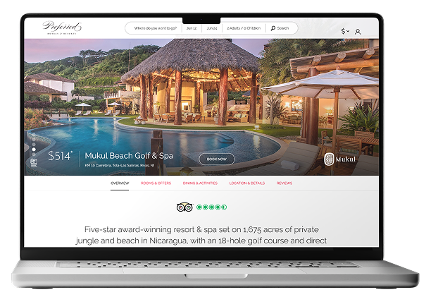
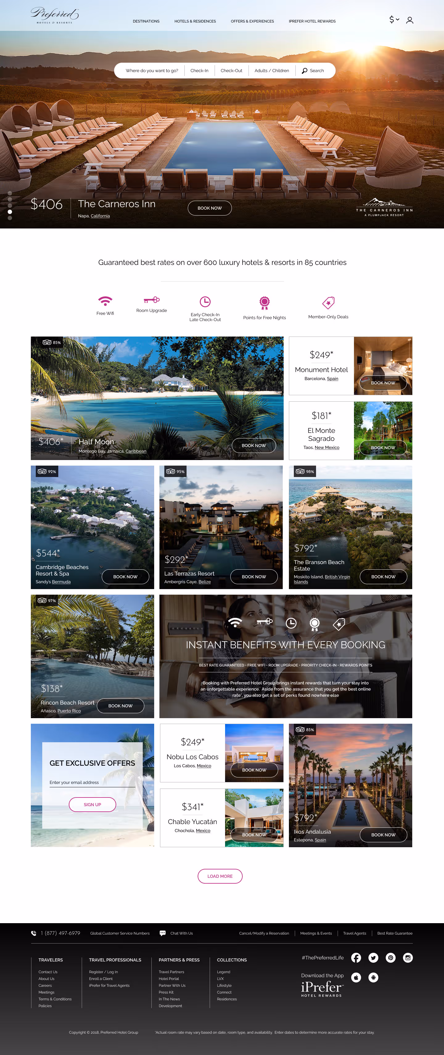
Increasing Mobile Engagement by 83% through strategic UX.
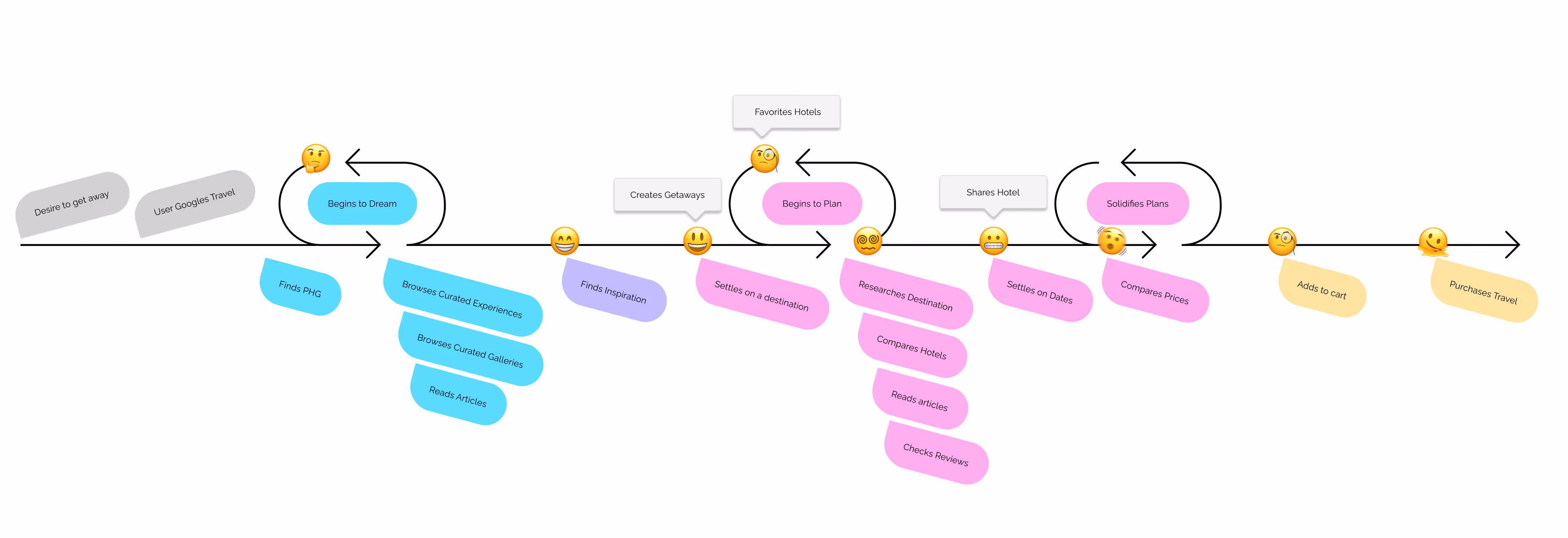
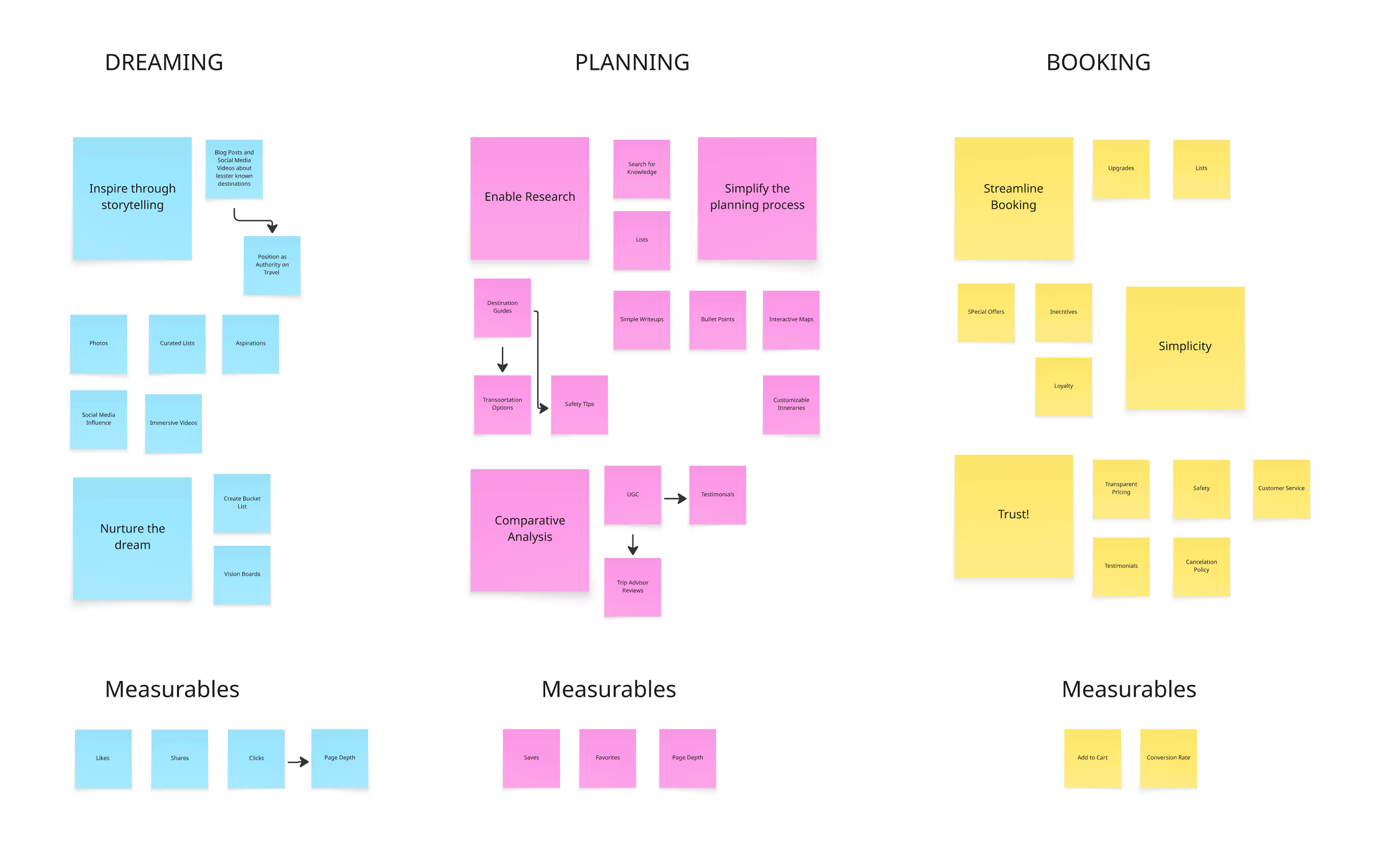
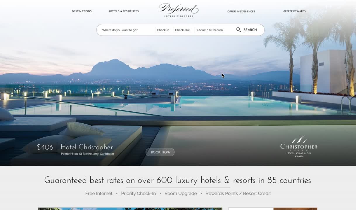
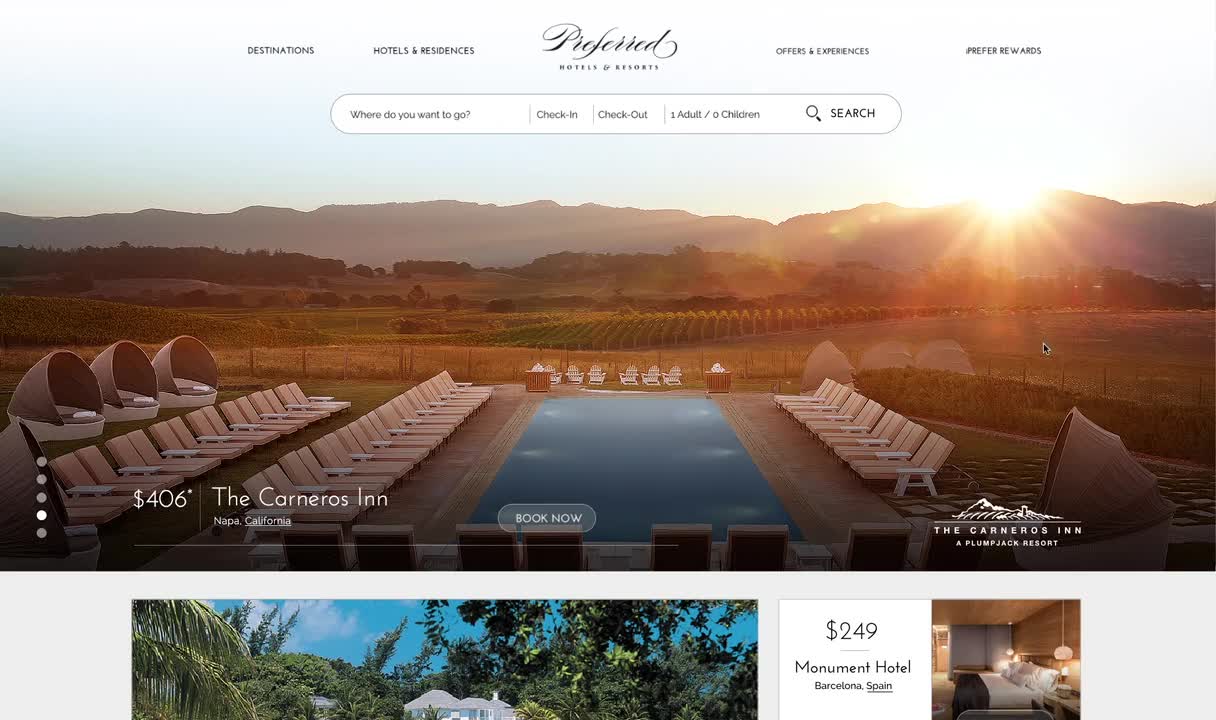
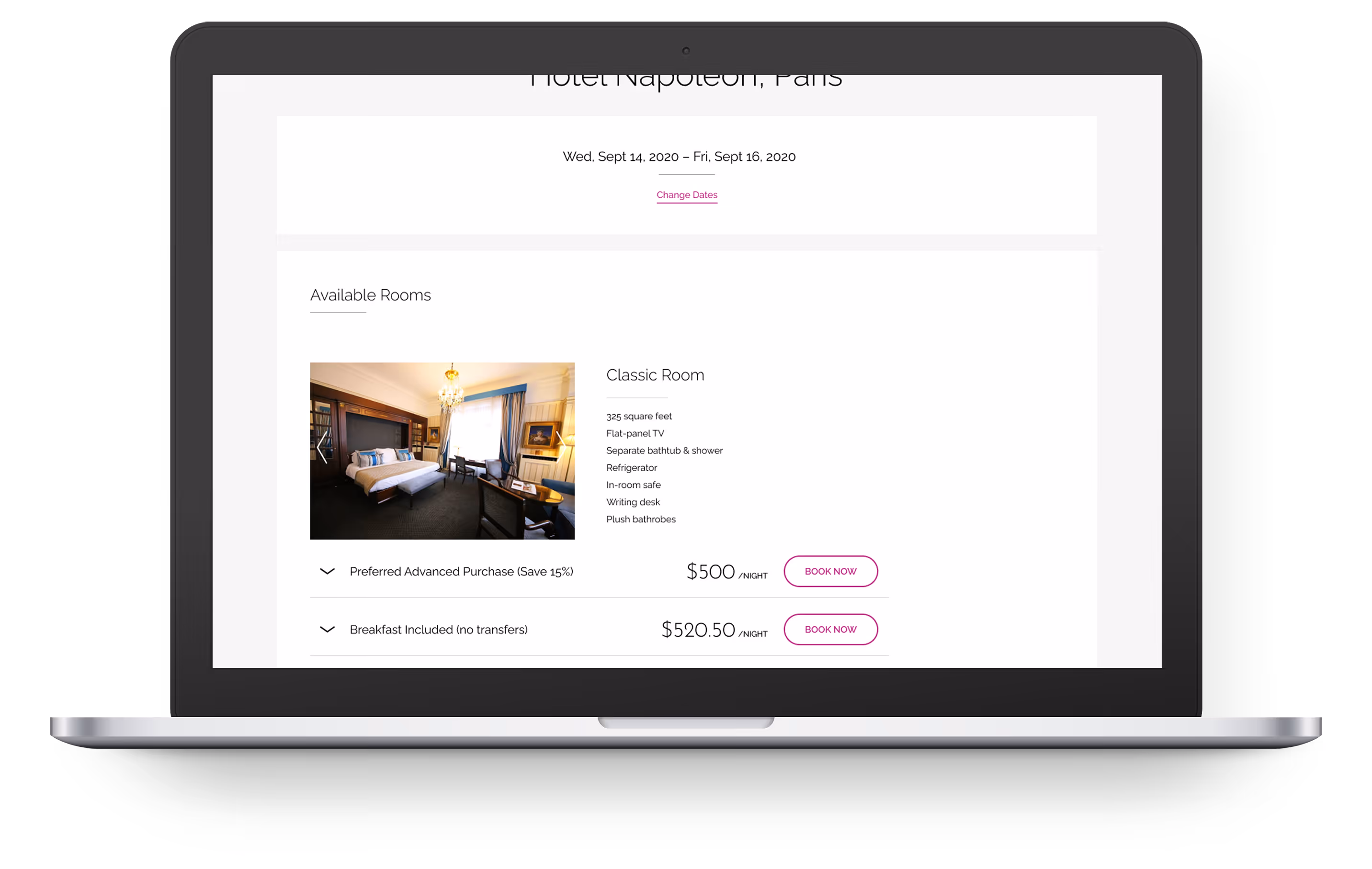
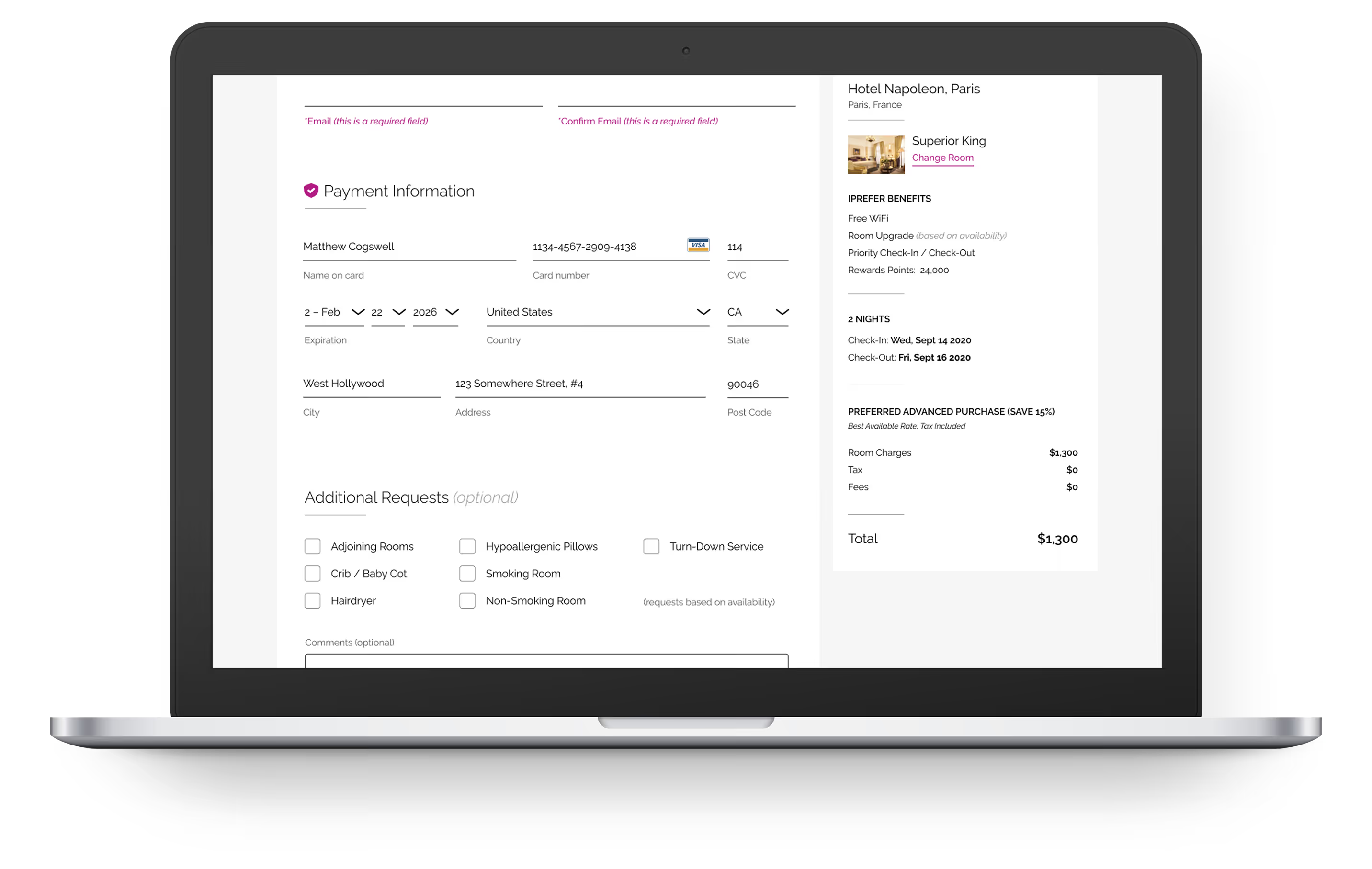
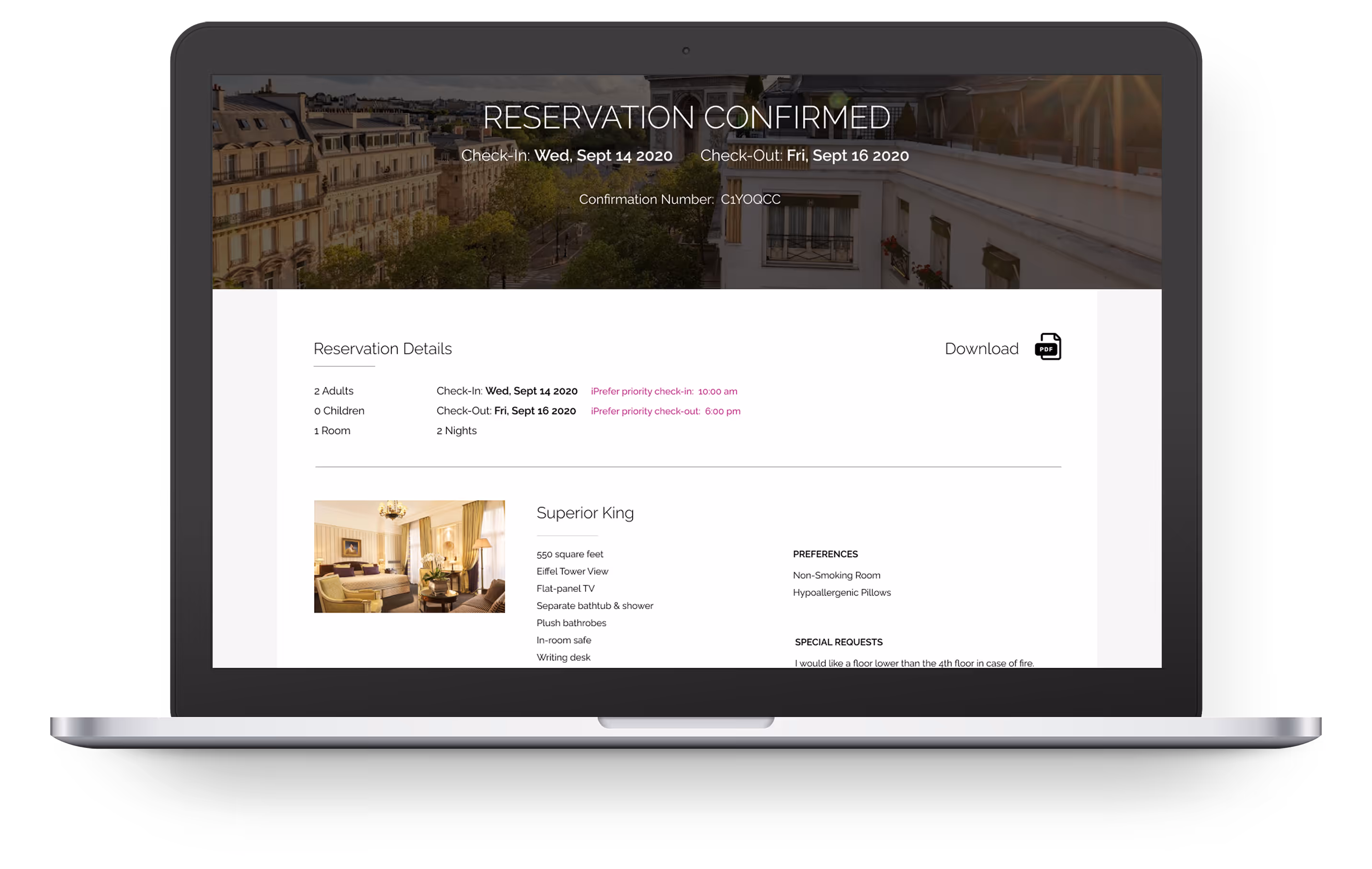
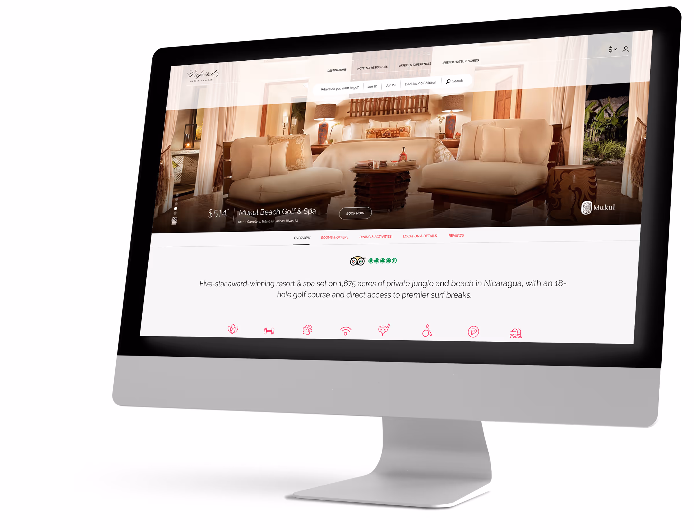
PROBLEM
Preferred Hotels & Resorts had noticed a lag in conversion and felt their engagement could be better but didn't know how to go about capturing users and converting them.
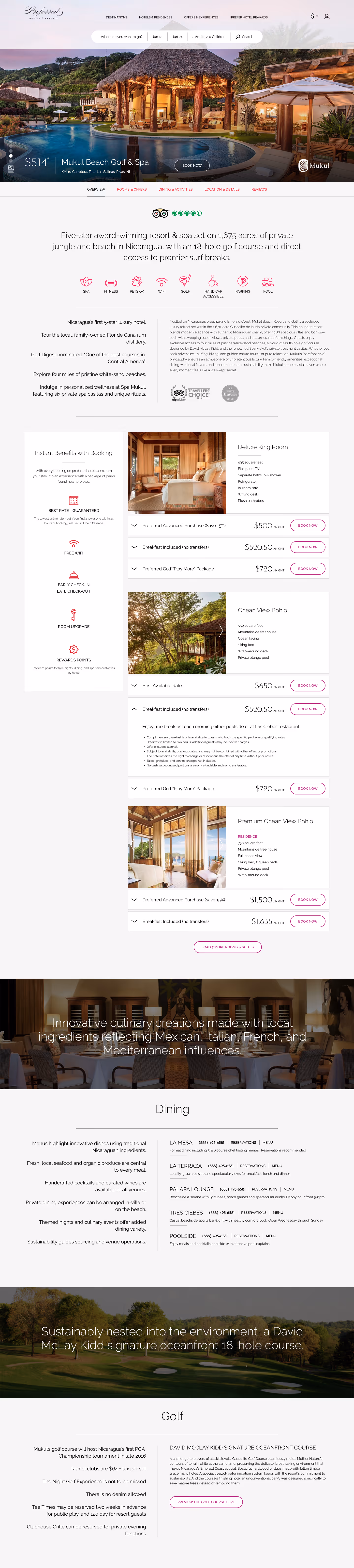
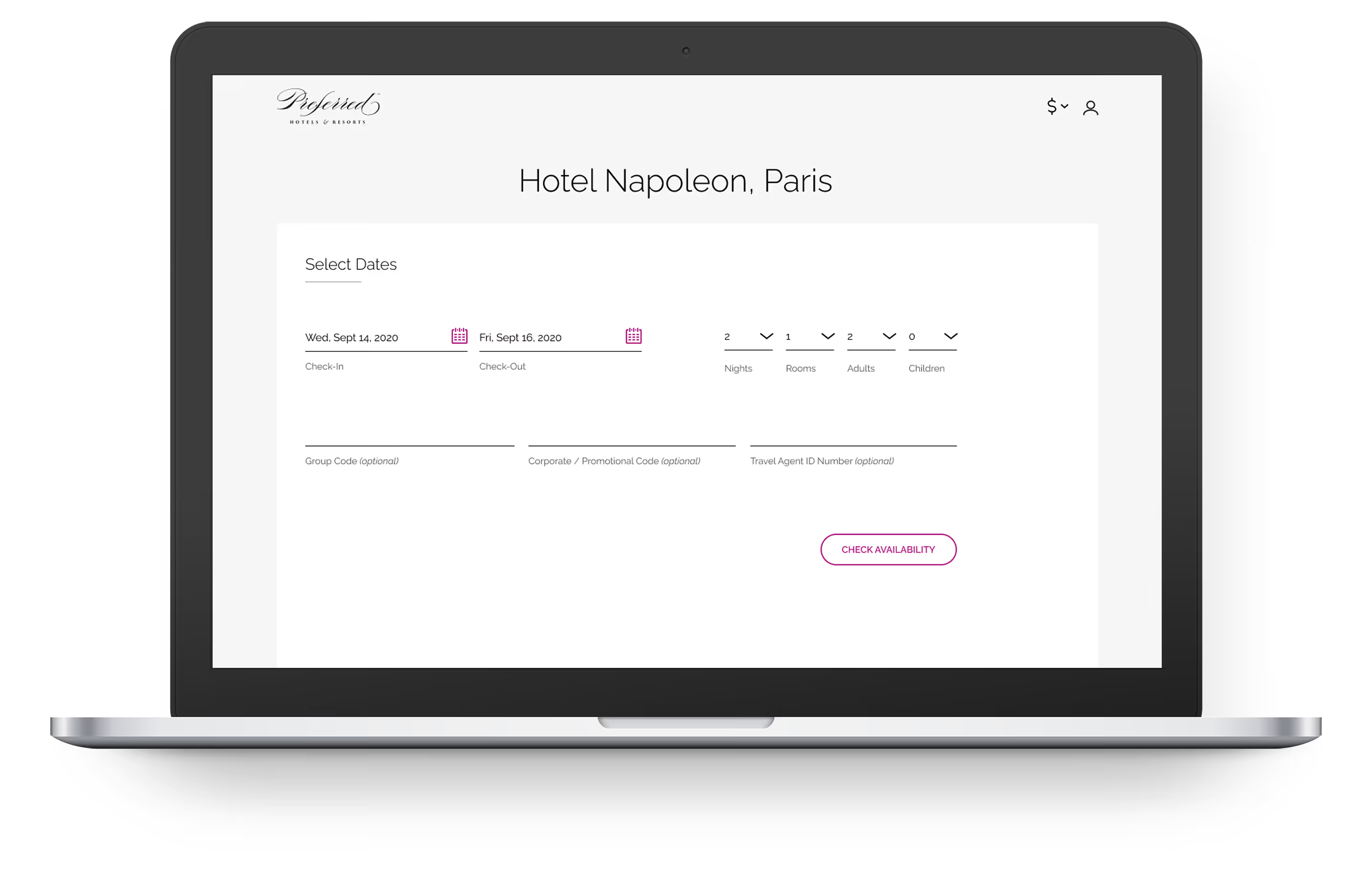
SOLUTION
Design an online experience that would both delight users and lead to a 25% reduction in cart abandonment.