Taco Bell

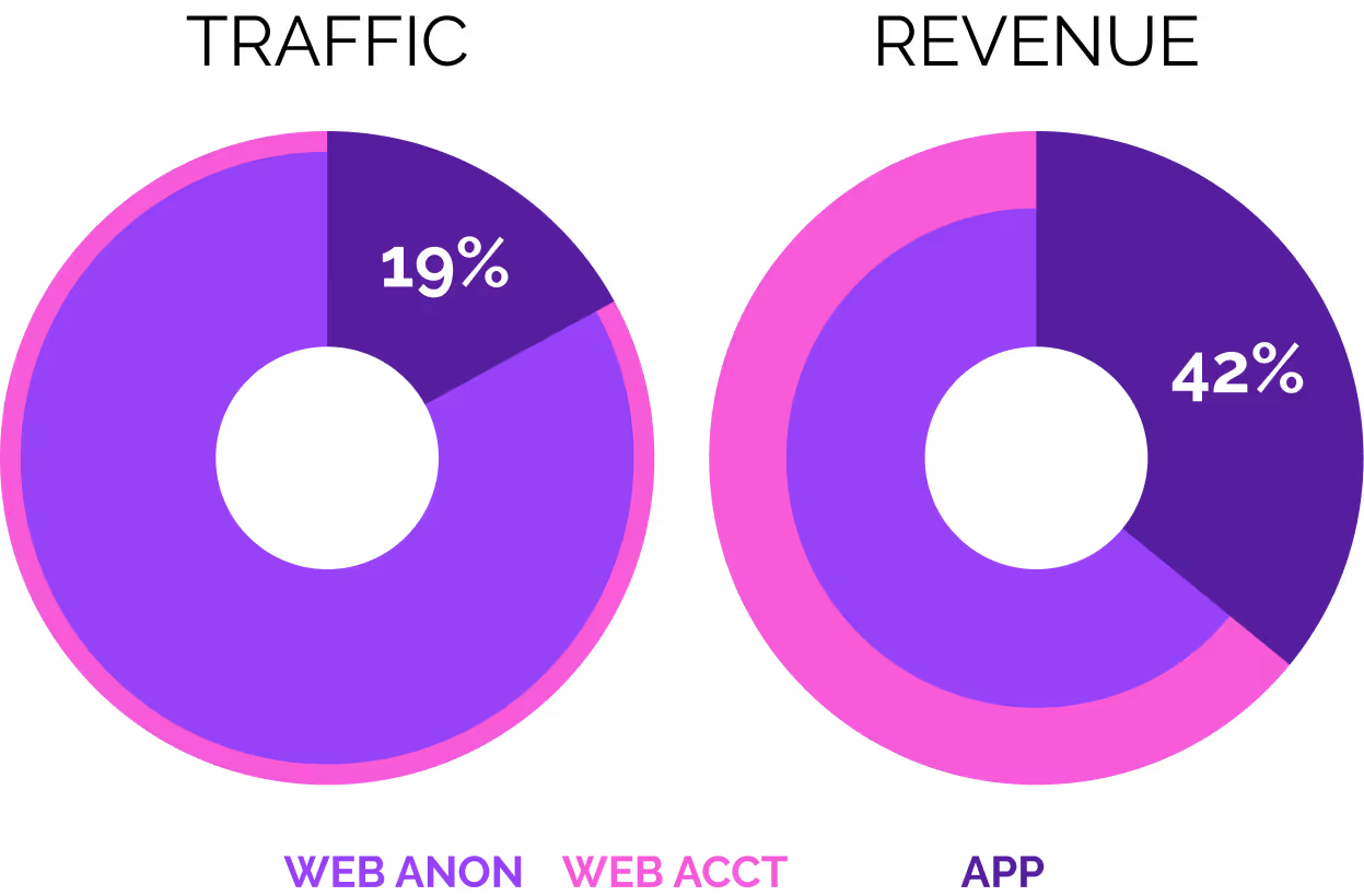
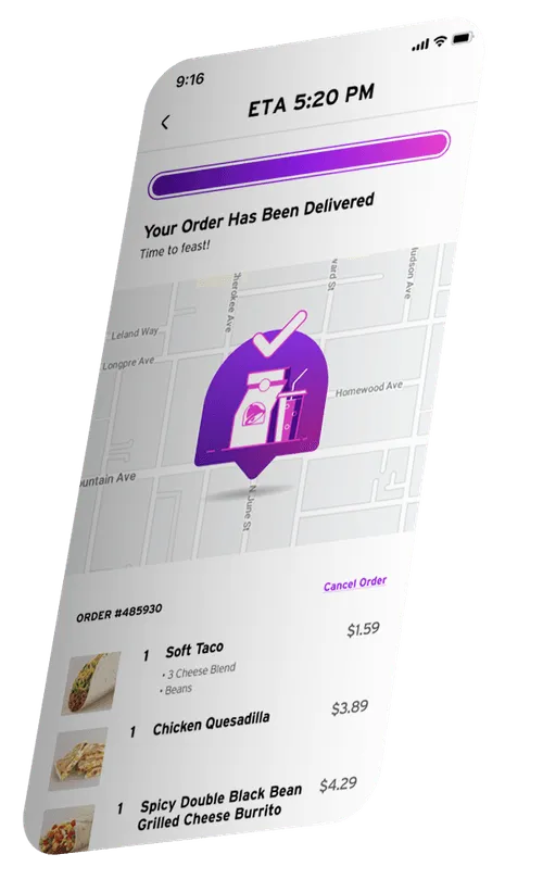
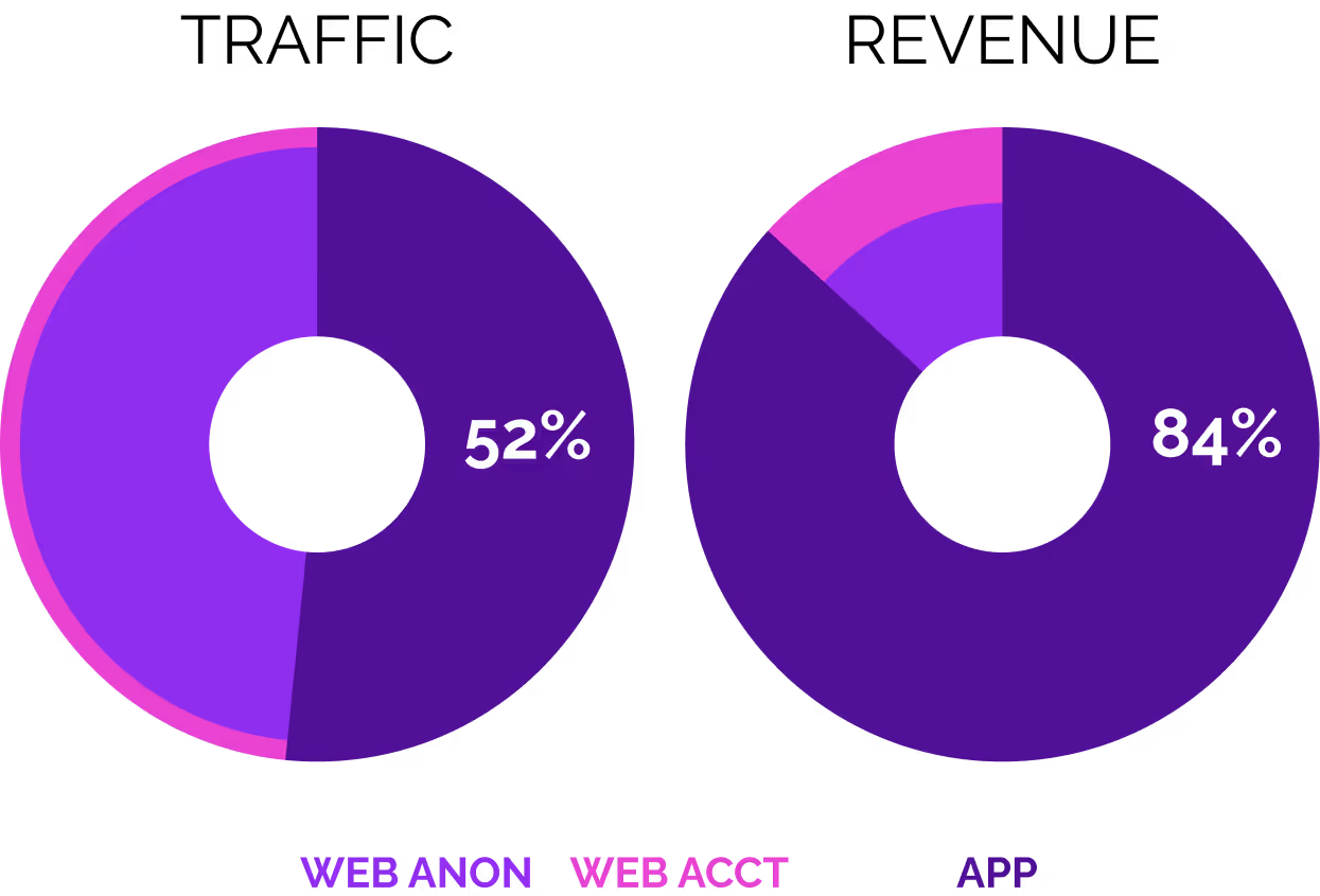
Increasing transactions for Taco Bell by 148%
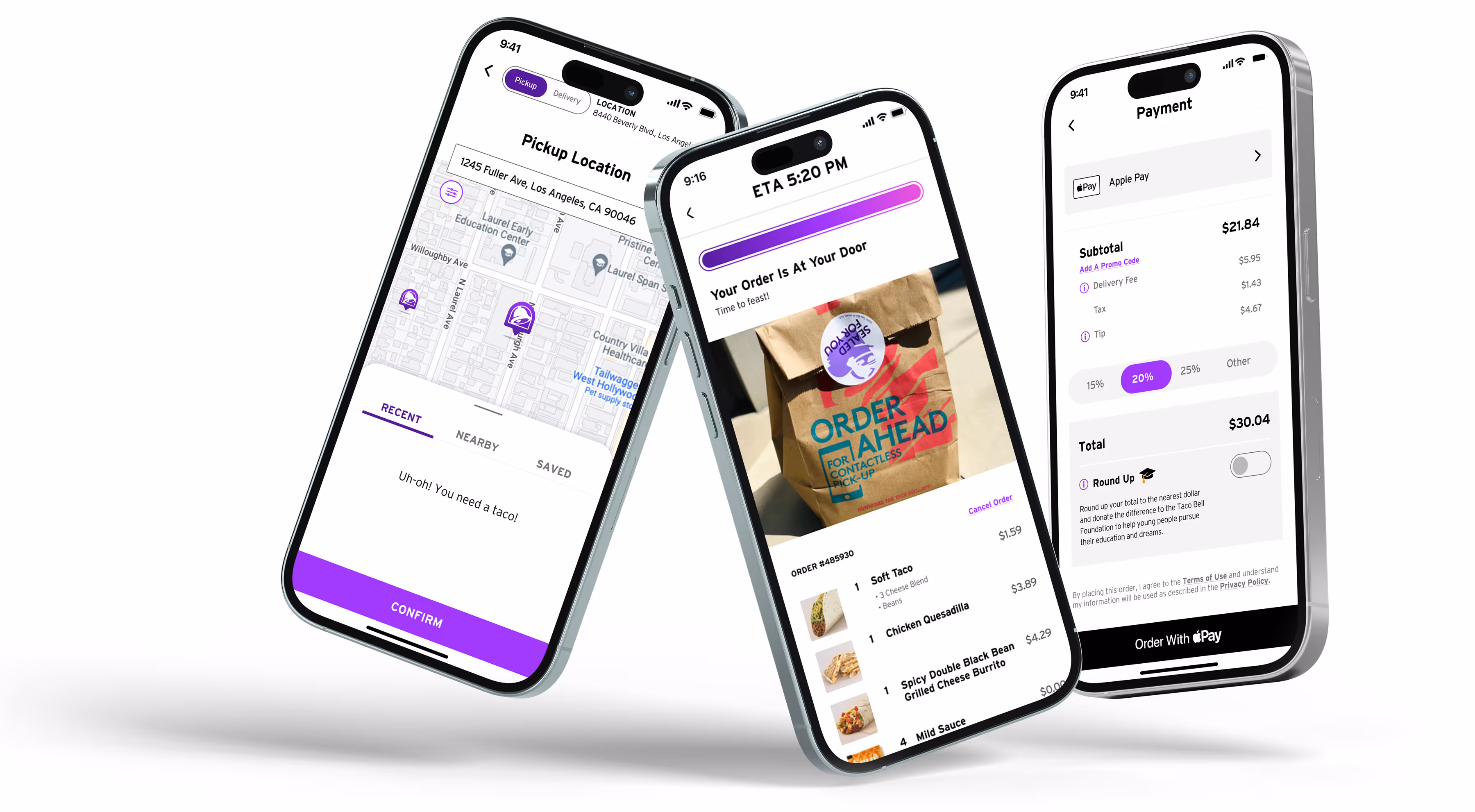
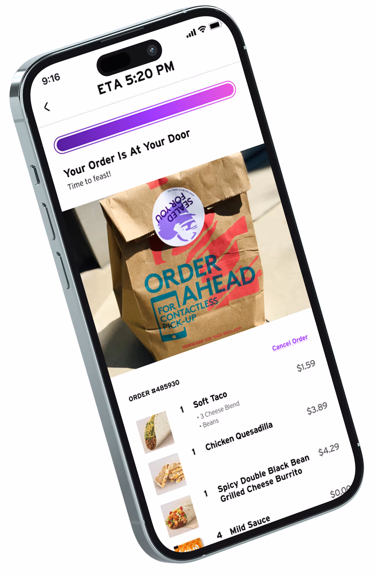
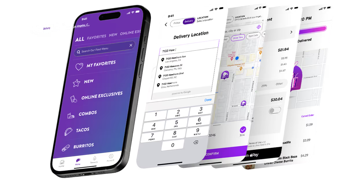
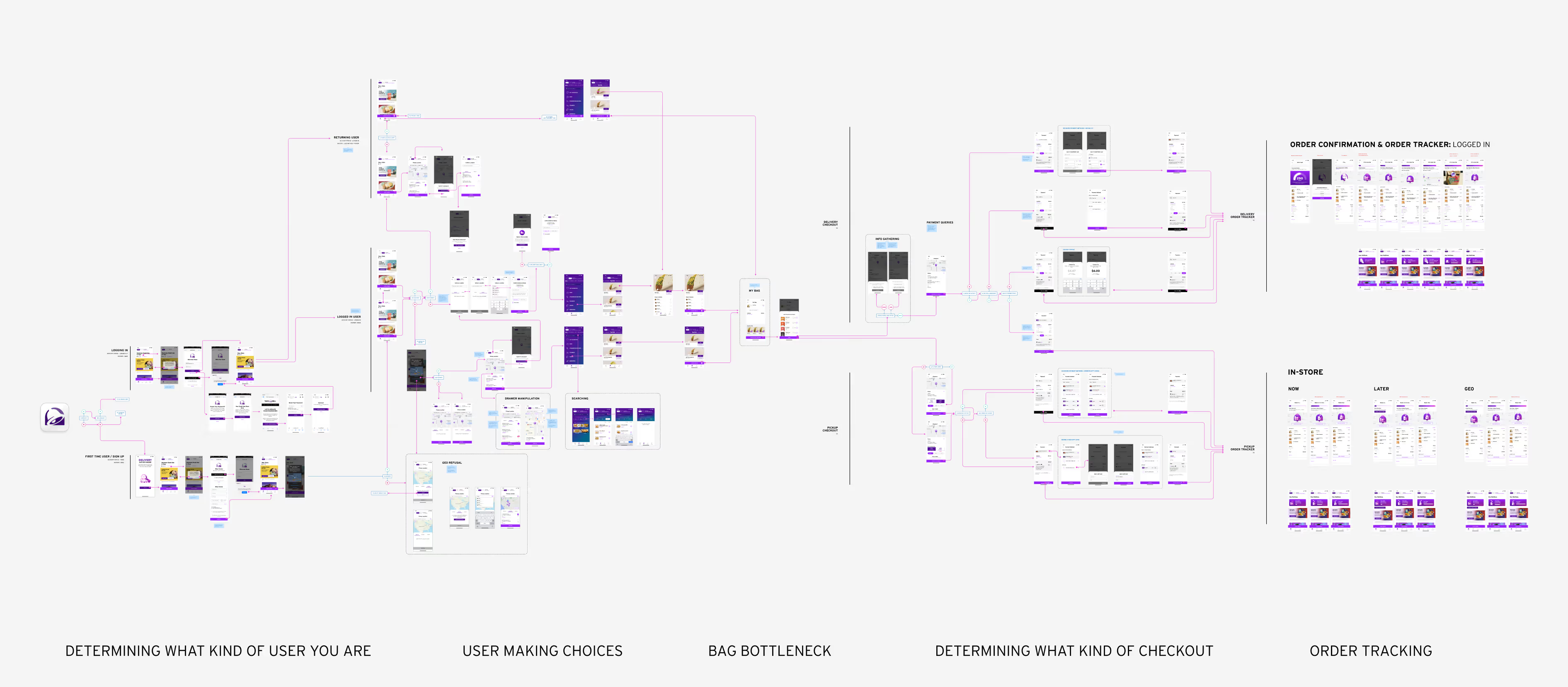
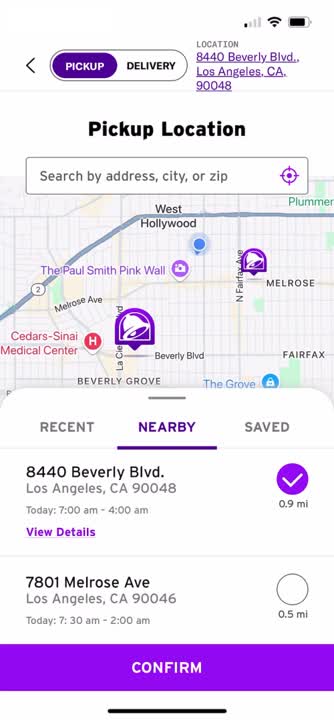
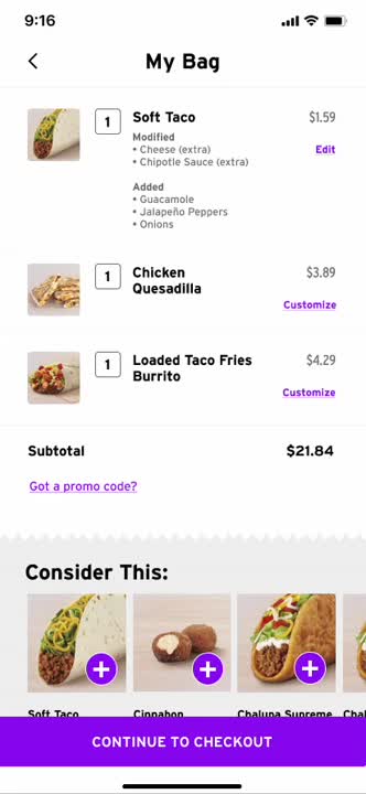
PROBLEM
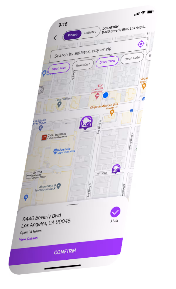
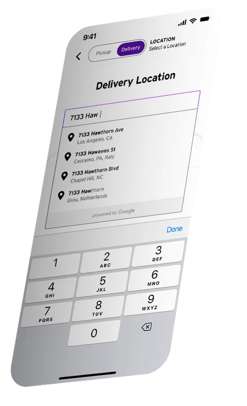
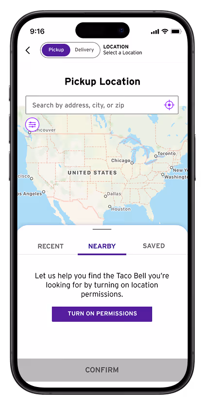
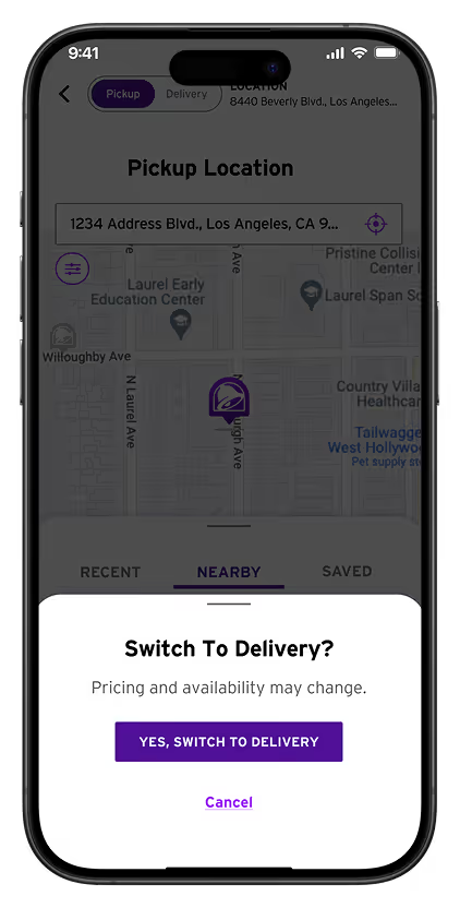
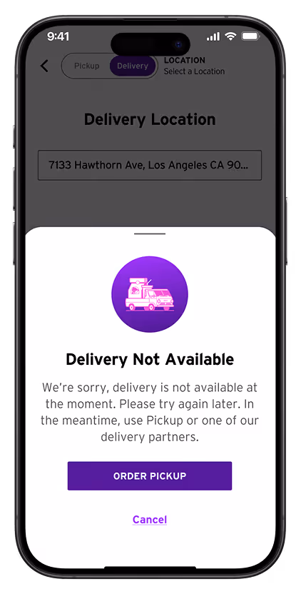
Taco Bell needed to add delivery to their app and increase conversion for America’s 4th largest fast food chain.
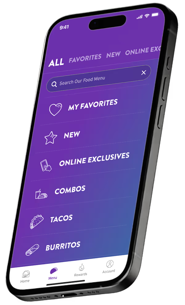
SOLUTION
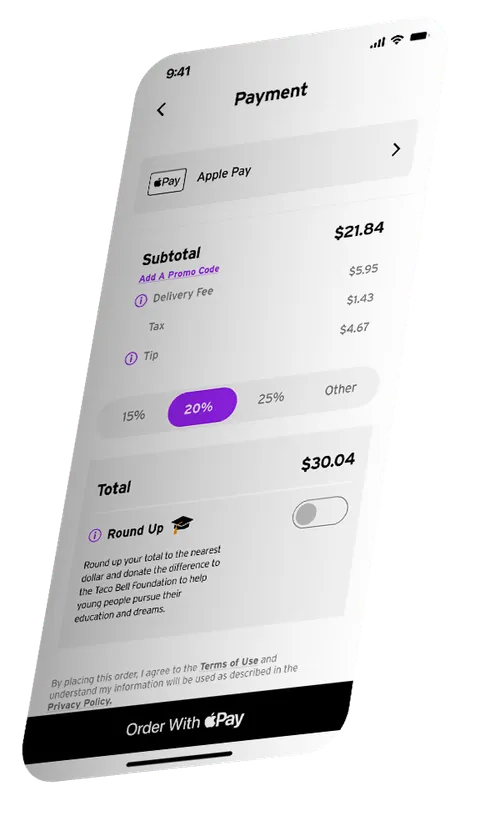
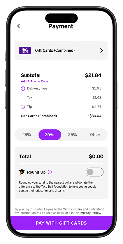
Bring delivery to the Taco Bell app while at the same time revising the design to reduce cart abandonment b7 15%.
Three smartphones displaying a food delivery app with pickup location map, order details, and payment screen.
Smartphone screen showing food delivery order with estimated arrival at 5:20 PM, displaying a brown paper bag with a sealed food sticker and order details including soft taco, chicken quesadilla, and spicy double black bean grilled cheese burrito.
ROLE
Product Design
TOOLS
Adobe
Figma
PLATFORM
Native App
OVERVIEW

Inheriting a broken app hemorrhaging customers to Uber Eats

Taco Bell - the nation’s 4th largest fast food chain had a “borderline unusable app” that was losing customers to the rise of established gig delivery apps like Uber Eats and Door Dash.  While they clung to their web sales for truly loyal, deal-focused customers, they recognized the need to compete with the delivery giants and bring DaaS to their app.

Opportunity:  Bring delivery to the app while fixing the checkout flow  ...and polish the app in the process.

Challenges

Minimal Disruption

Delivery had to be added without disrupting the core of the app - the home screen and menu pages.  These could be polished but their functionality had to remain as was.

Whitelabel DoorDash

Taco Bell was going to leverage Door Dash’s API and delivery infrastructure.  The problem was, how do you TRULY whitelabel it when DoorDash controls communication protocols?

User Behavior

Users had become accustomed to using UberEats instead of the Taco Bell app.  The question was:  Can we re-engage lost users once the app has been fixed?
RESEARCH

Knowing your customers is key to knowing your solutions

Prior to starting, it was crucial to get to know how the Taco Bell customer shops.  Given the fact that the app was barely usable (cart failures, severe degree of abandonment) it was no surprise that the website provided a bulwark against total revenue loss.  
Two donut charts comparing metrics: left chart shows 19% for Web Anon, right chart shows 42% for App, with Web Acct represented in pink around both charts.

Pre-DaaS Traffic & Revenue

Before implementation, Taco Bell’s traffic skewed heavily towards the web showing that users were not engaged with the app.  Those that were engaged, however, showed a strong desire to purchase.  

Furthermore, anonymous users of the web were high users but low converters.

Anonymous Users

Even though anonymous users make up a significant majority of traffic, it was decided that the app would force the users to make an account for checkout simplicity.  

85% Returning Users

The vast majority of users are loyal users to fast food - you have your chain and you stick with it.  This allowed us to gear the happy path towards returning users and utilize behavioral data to smooth out the process.

Two Minutes or Less

Behavioral analysis showed that QSR (Quick Service Restaurant) app users expect to be able to make their selections and purchase in under two minutes before they abandon the app for something easier.
DESIGN

Strategy: Add & Expand

Given that the app had to feel unified, a holistic approach was determined to be the best path forward.  We would overlay a Delivery/Pick Up toggle onto the whole of the app, while expanding the capabilities to include delivery and rebuilding an entire new checkout system.
taco bell app iphone skew showing the delivery toggle
taco bell app iphone skew
taco bell app iphone skew showing the map
taco bell app iphone skew showing address selection
taco bell app iphone skew showing checkout
taco bell app iphone skew delivery in process
Five overlapping smartphone screens showing a food delivery app with menu categories, delivery location input, map with restaurant locations, order summary, and delivery tracking.

Over 65 different Userflows

Accommodating New and returning users, with and without Geo Location, as well as both Pickup and Delivery required great attention to the extensive user flows.  In addition to a comprehensive user flow, isolated flows were created detailing everything from core launch, to switching methods, to checkout.
Flowchart of a mobile app user experience showing steps from user type determination, making choices, bag bottleneck, checkout process, to order tracking with connected screens and interfaces.

Delivery Selection

Tabbed drawers made easy work of selecting or inputting locations.  The app was designed to be smart, knowing what you did previously and defaulting to that as users tend to be creatures of habit.
Icon denoting an important metric
By reducing friction through the utilization of past behaviors, we were able to decrease task time by 63%

4-Step Checkout

Great care was taken to simplify and clarify the act of checking out.  The process was designed to be easily doable (even if you were stoned) and was stepped out into a 4 step process;  Bag, Logistics, Payment, Confirmation.
Icon denoting an important metric
By simplifying the checkout we were able to reduce cart abandonment by 15%.

Numerous Edge Cases

Mobile app screen showing a US map for selecting Taco Bell pickup location with a prompt to turn on location permissions.
EDGE CASE
If Geo-Location is turned off
The first line of defense was automatically determining where you were located.  However a surprising number (~30%) of people reject location services on food delivery apps even though it is perceived as a “functional necessity”.   We circumvented this by implementing an “input your location” function.
Mobile payment screen showing subtotal $21.84 with delivery fee, tax, tip, and gift card deduction, total $0.00, tip percentage options, and a Round Up toggle for donation.
EDGE CASE
Automatically use gift cards?
Gift cards are surprisingly common in the Taco Bell universe with people gifting them to students and loved ones.  The problem is, it is easy to accumulate cards with only pennies on them left over.  How to best manage this complexity?  We determined that combining them into an aggregate total and then automatically applying them would be the best way to make use of the gift card total.
Mobile screen showing a pickup location map with a popup asking to switch to delivery, including a purple button labeled 'Yes, switch to delivery' and a cancel link.
EDGE CASE
Switching between Pickup and Delivery
Flipping the toggle back and forth is an easy thing to do but the problem is that menu prices and availability are different between the two services and some items are “in store only”, and delivery comes with a Door Dash price surcharge.  The solution was to warn the user in a simple way prior to enacting the change.
Mobile screen showing a delivery app interface with a message stating delivery is not available at the entered address and offering an option to order pickup or cancel.
EDGE CASE
Is delivery even available in your area?
In some cases (especially rural location) delivery might not be available so a friendly warning was concocted to let people know.  Upon app load, we automatically switch to pickup but if the user chose “delivery” we’d serve them the warning and prompt them to use pick up instead.
TESTING

Multiple rounds of user testing

We conducted 2 days of user testing over zoom, allowing day 1 feedback to inform design iterations to day 2’s testing.  Subjects ranged in age and background but all were QSR app users.
Telecommunications - Eats Taco Bell often
Environmental Consultant - Never used the TB app but loves the breakfast burritos
EBay Seller - Gets Crunchwrap Supreme every two weeks and orders delivery for her dad
Undergrad, Bible major.  Big Taco Bell fan.  Downloaded the app once.
Undergrad studying Phys. Ed.  Walks 10 minutes to Taco Bell
Undergrad studying criminology. Orders TB on DoorDash or UberEats
IT tech for a university & side gigs.  Has the TB app and gets the online exclusive $5 box
Grad student studying biostatistics - Ordered the $5 box on the app once but more of a drive-thru person
Nurse, mother, and veteran.  Frequent TB customer.  users the TB app to order drive-thru and DoorDash for delivery
Sales Associate at Foot Locker.  Uses TB app for the rewards. Frequent pickup/delivery switcher

Prototyping

To our surprise, younger users dashed through the app in under one minute.

Overall the response to the app was strong and provided us with extensive feedback on what to change and validation on what to keep.
Testimonial with photo of a young man named Ethan saying, 'Super simple and to the point. I like it a lot more than Uber Eats and DoorDash.'
Quote with a photo of a young man named Jalen, stating, 'It feels very engaging. Might be quicker than Uber Eats.' on a pink gradient background.
RESULTS

We definitely delivered the goods

We took a “borderline unusable app” and turned it into a powerhouse that drives a significant part of a $16 billion dollar franchise and helped cement Taco Bell as the 4th largest QSR in the nation.
Two donut charts showing 52% of DAUs on web anonymously and 84% of DAUs on the app, with web anonymous in purple, web account in pink, and app in dark purple.

Post-DaaS Traffic & Revenue

We were able to increase the app traffic by 174% by stabilizing the app’s performance and double app revenue by streamlining the checkout flow
Taco Bell meal with a drink cup and tacos in a fast food restaurant setting.

Ranked #2 QSR app in the nation

“This app has also come an incredibly long way—it was borderline unusable about two years ago.”
Read Article
Users loved it too
reddit review of taco bell appcomment on reddit review of taco bell app

Achievements

Total Transaction
up 148%
Average Order Value
up 83%
Cart Abandonment
down 33%
Engagement
up 7%
E-COMMERCE
Laptop, tablet, and smartphone displaying a luxury hotel booking website with scenic resort images and search options.
Increasing Mobile Engagement by 83% through strategic UX.
VIEW CASE study
E-COMMERCE
Laptop, smartphone, and tablet displaying a music streaming app with album covers and playlists on a dark background.
Increasing online revenue by 300% for Warner Music Group
VIEW CASE study