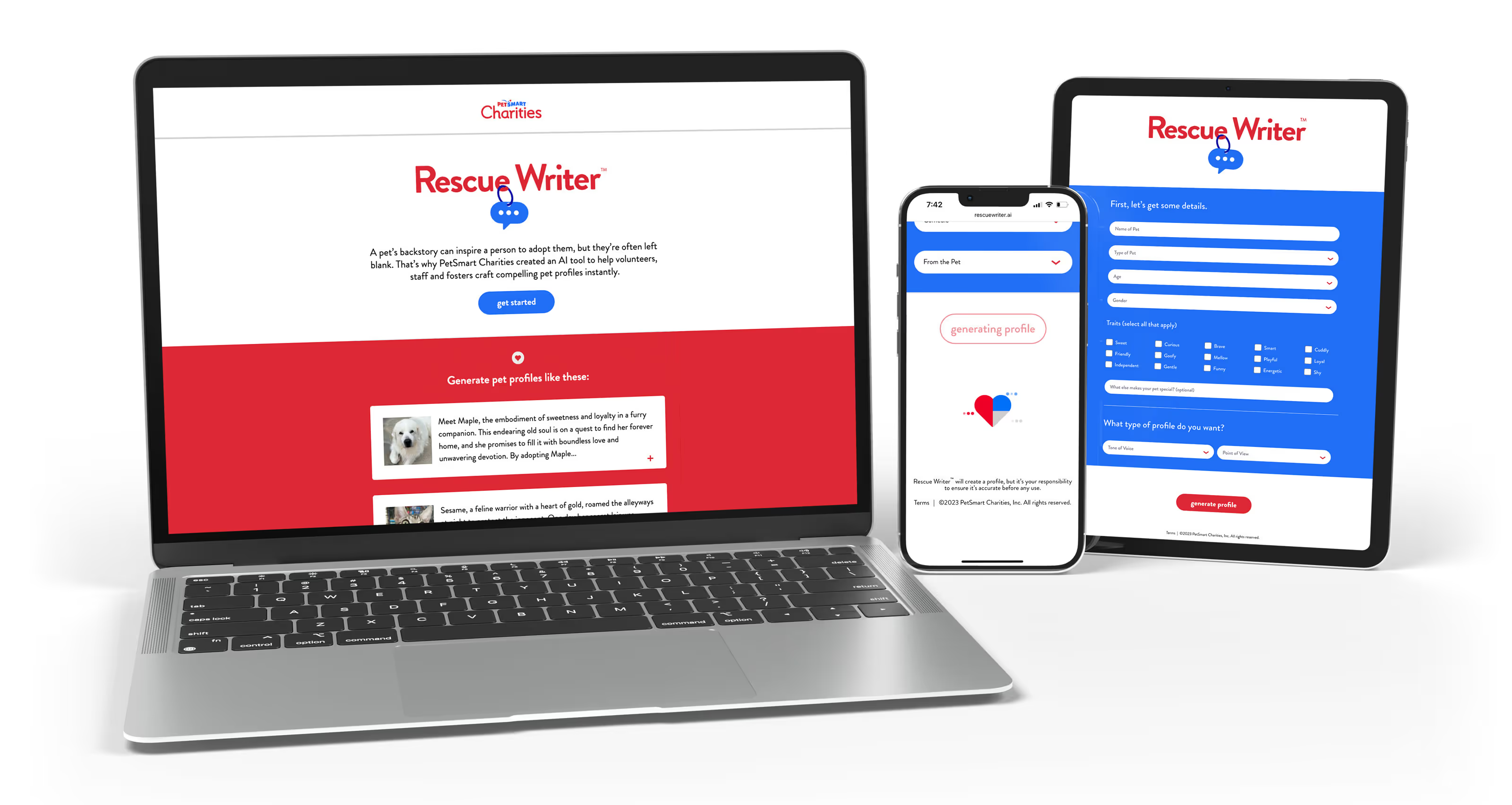
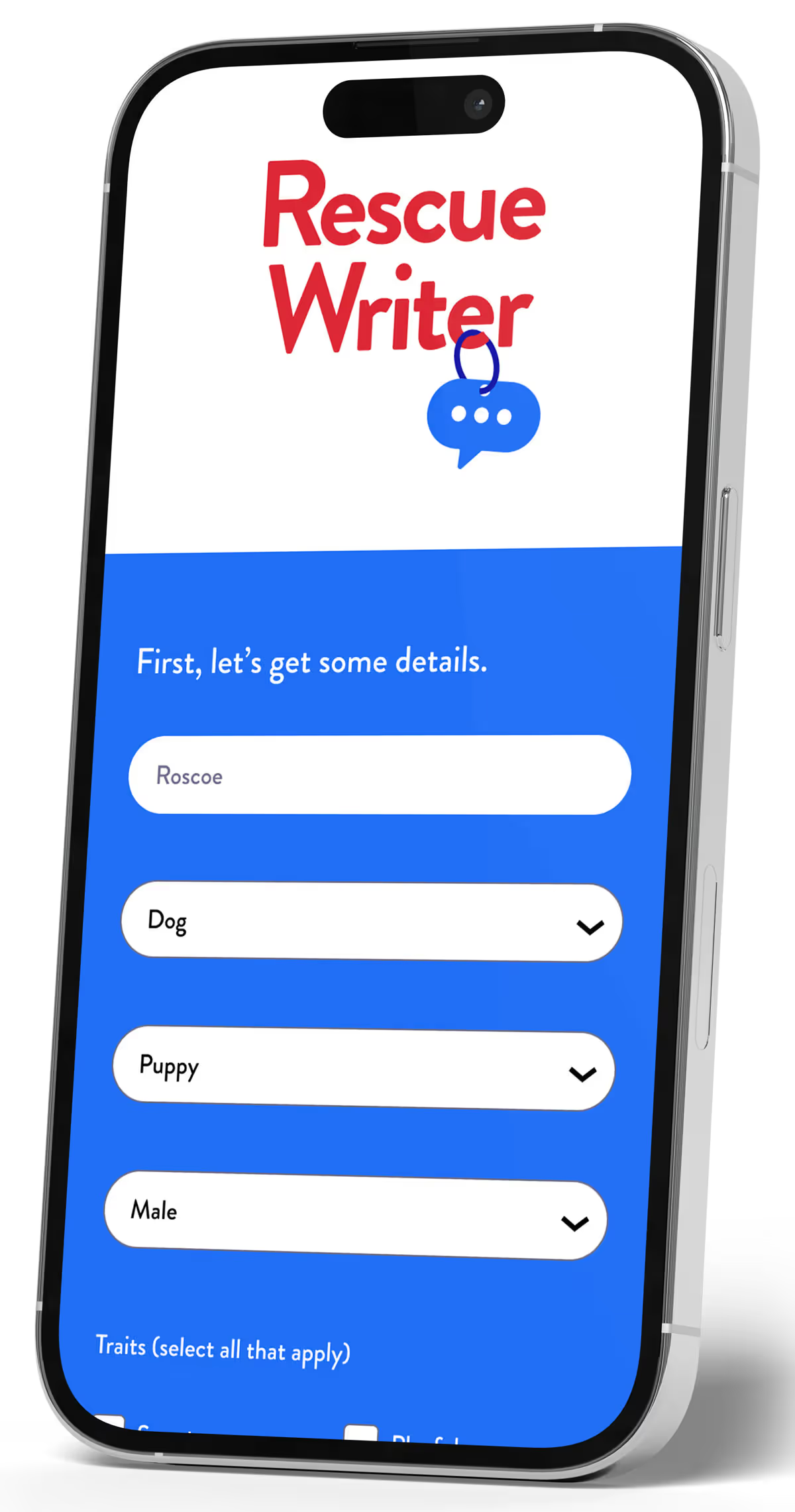
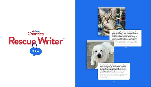
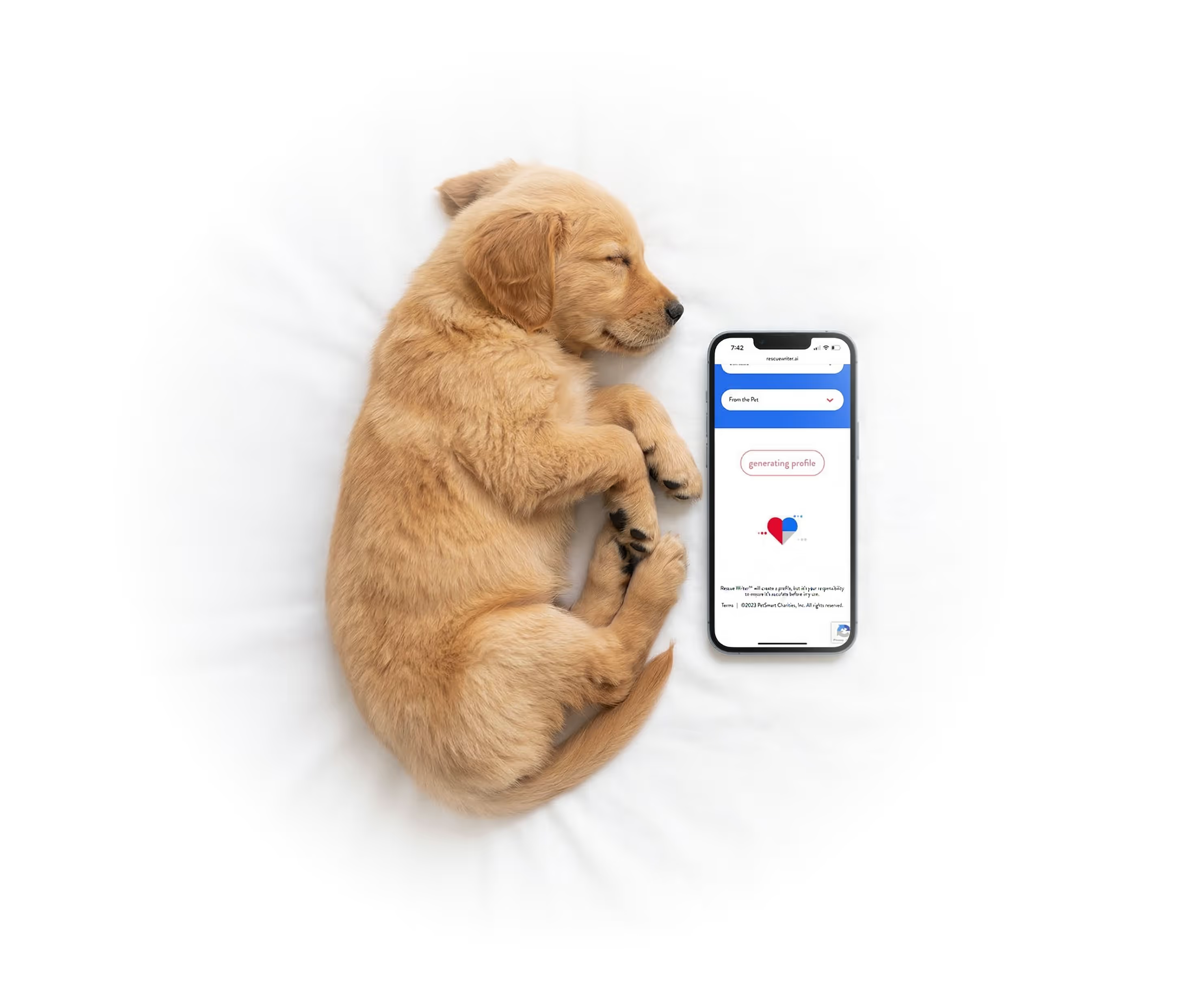
Rescue Writer
Using AI to turn data into 350,000 life-saving stories.
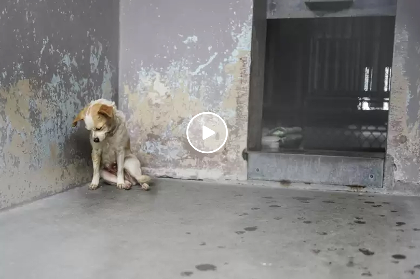
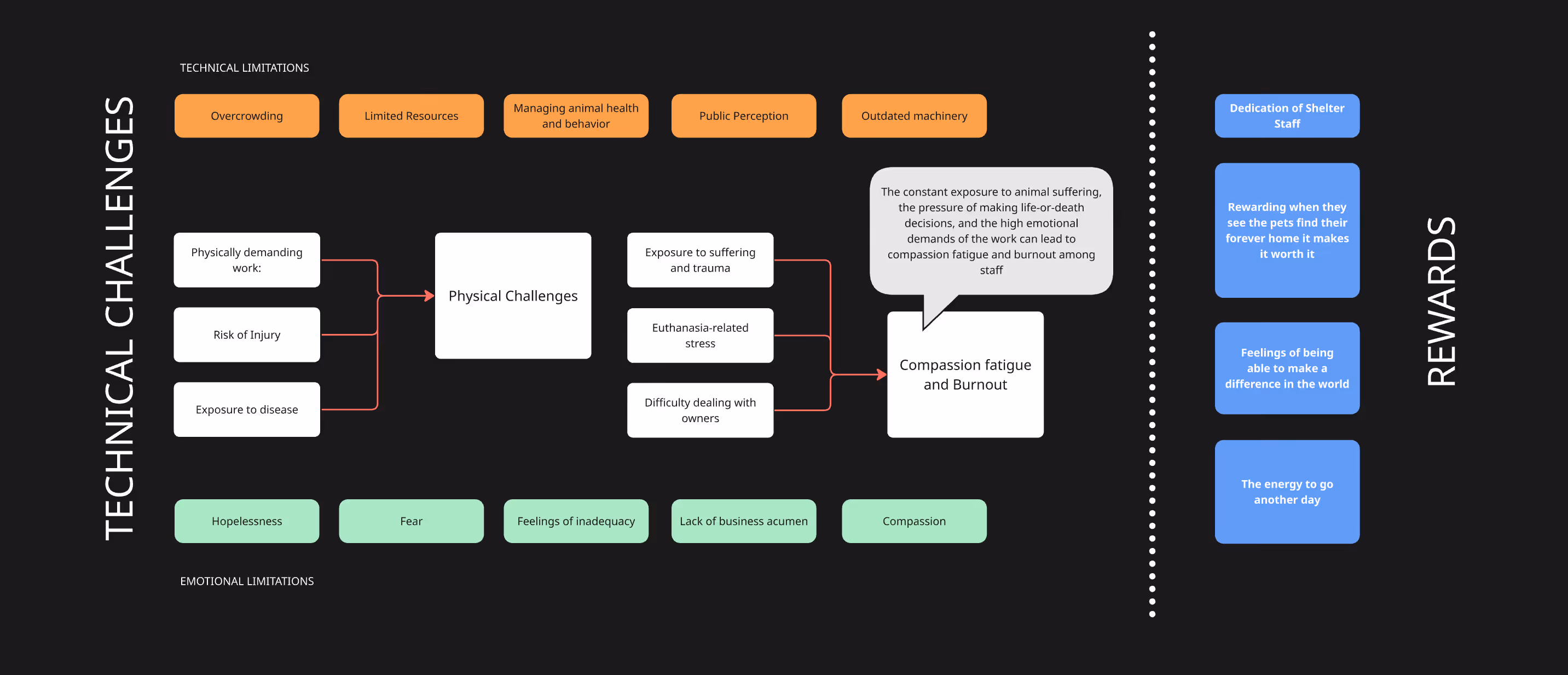
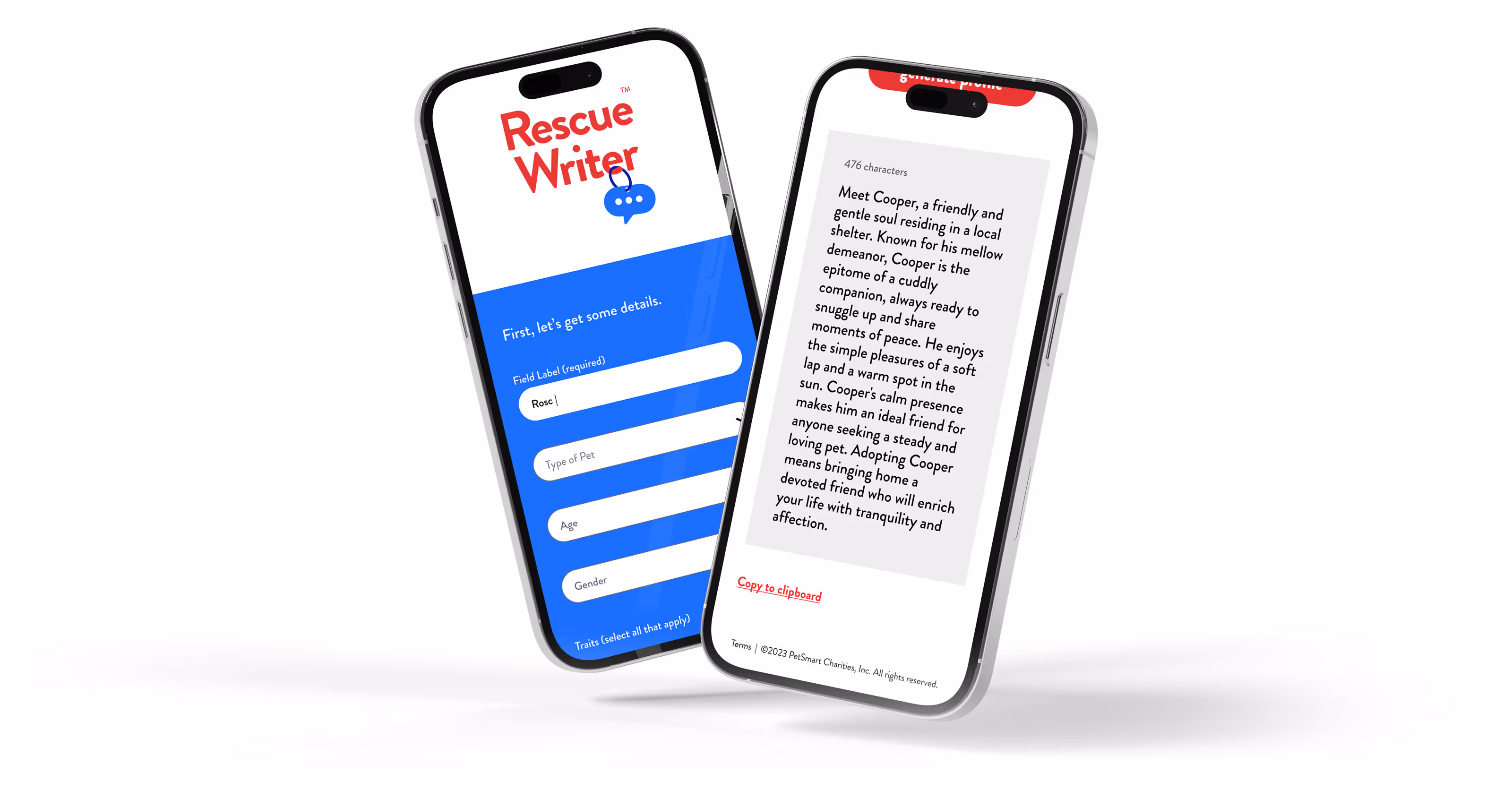
PROBLEM
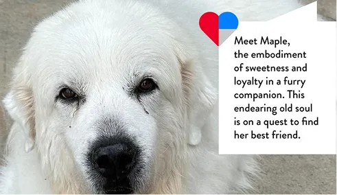
Shelter animals are 10X more likely to get adopted if they have a bio, but shelter staff are too overworked to created them.
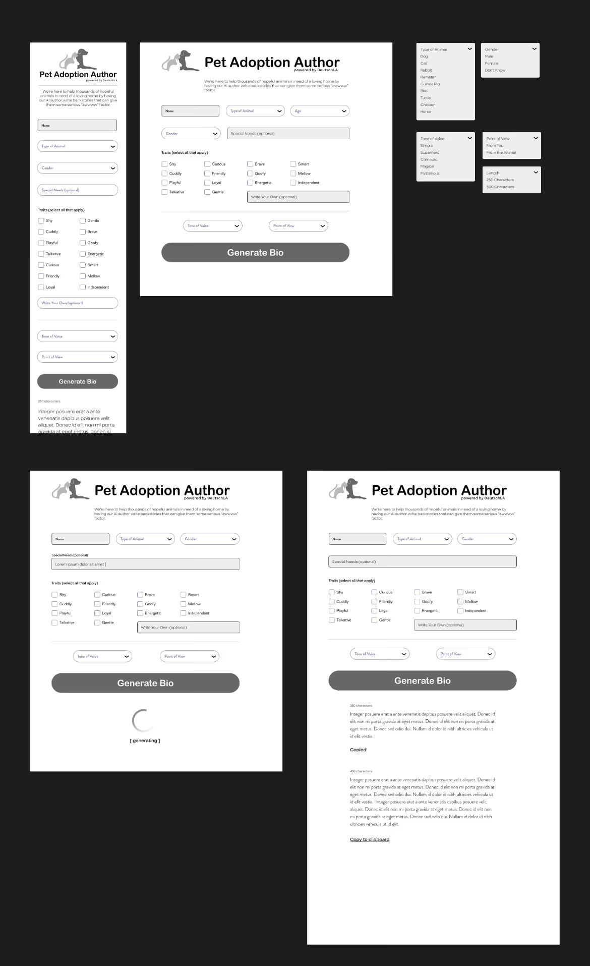
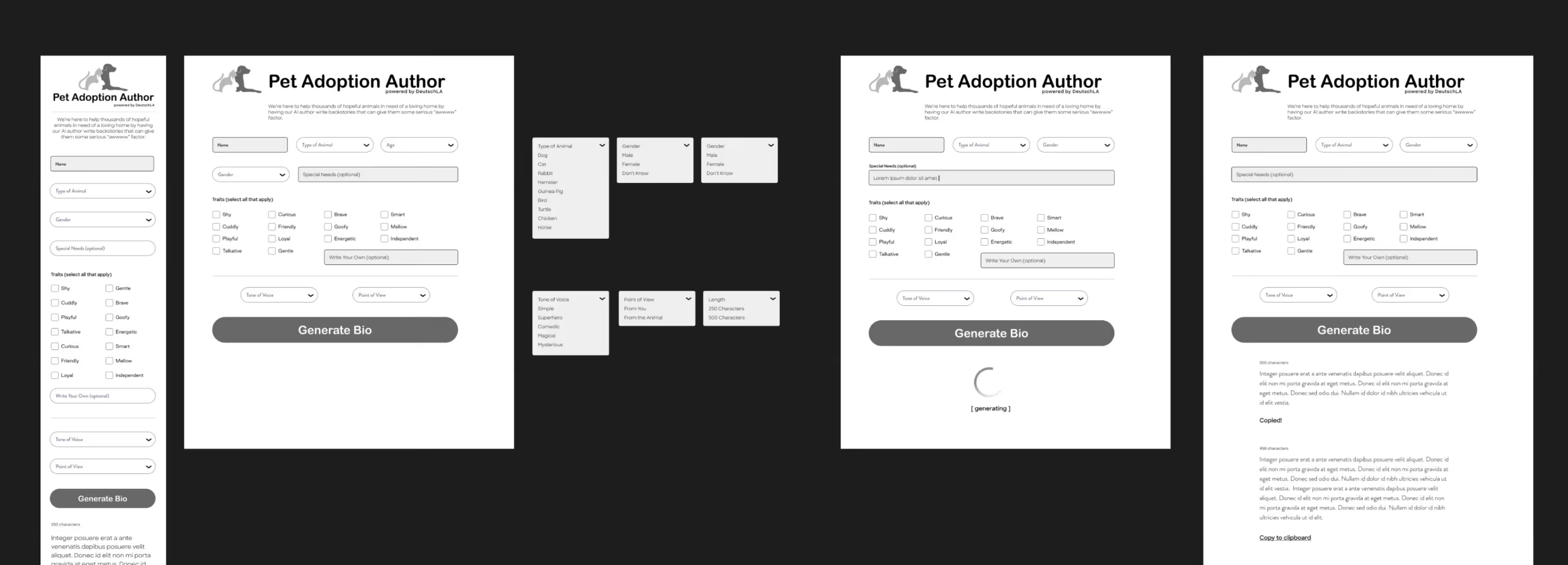
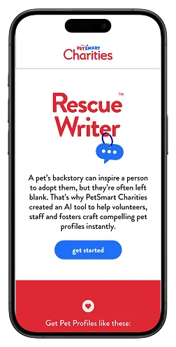
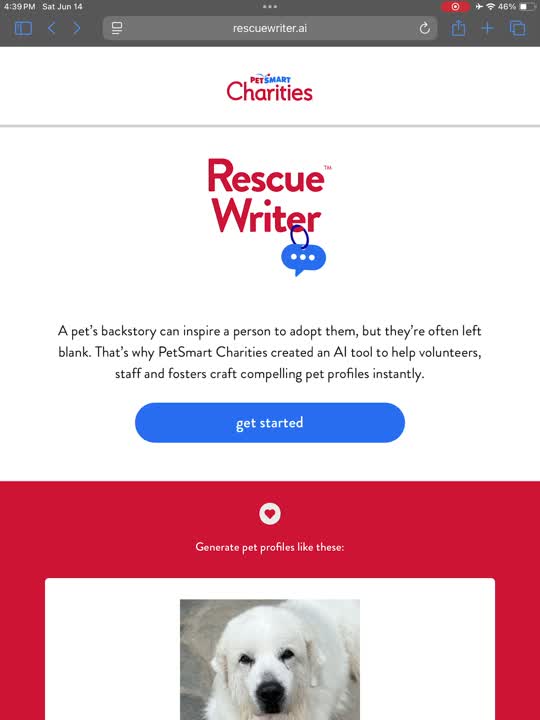
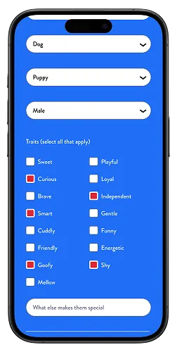
SOLUTION
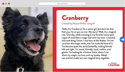
Build a high-velocity, generative AI engine that humanizes shelter data by converting cold traits into warm, narrative-driven bios... in seconds.