
The launch of Walmart GoLocal represented a significant strategic initiative for Walmart, expanding their formidable logistics capabilities to serve other businesses.
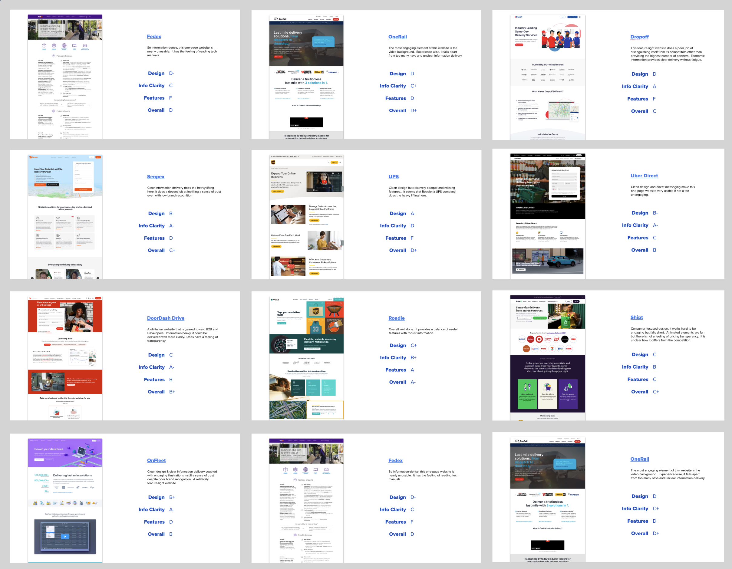
As the UX designer for the website, my role began with a comprehensive competitive audit. This involved meticulously analyzing existing players in the white-label delivery and last-mile logistics space, identifying their strengths, weaknesses, and key user flows. Understanding the competitive landscape was crucial for positioning Walmart GoLocal effectively and highlighting its unique value proposition, particularly its nationwide coverage and the backing of Walmart's established retail expertise. This research provided the foundational insights needed to define target audiences and their specific needs, ensuring the design would resonate with potential business clients.
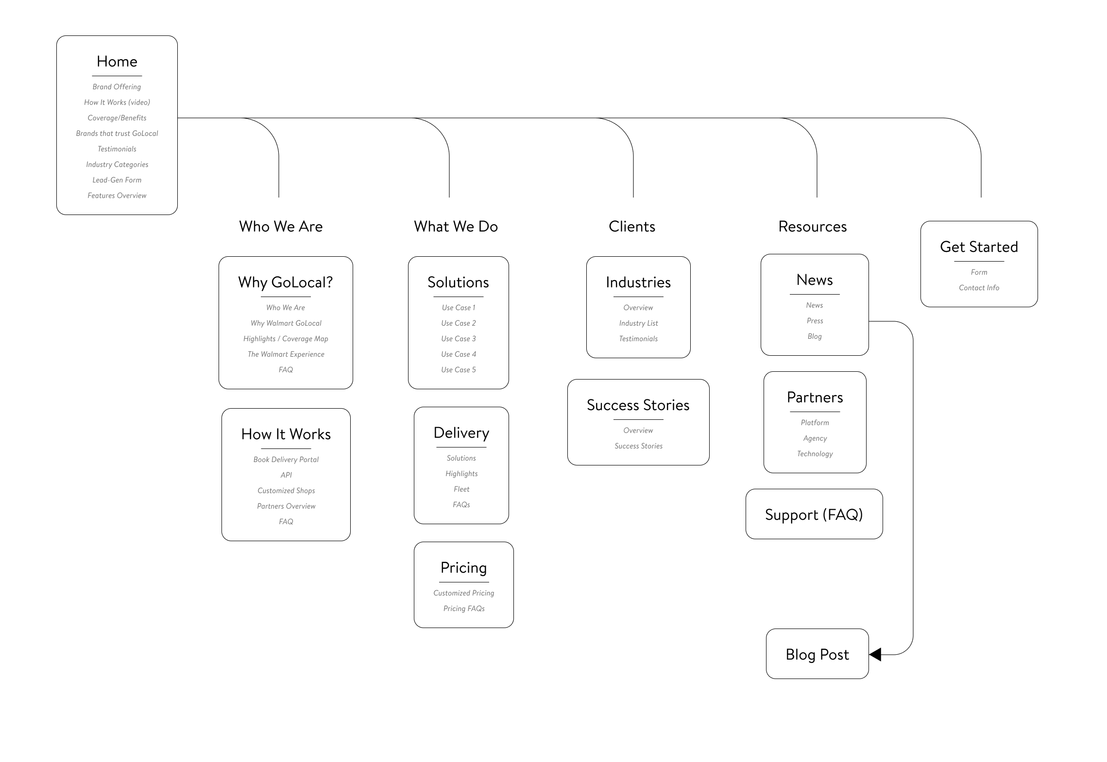
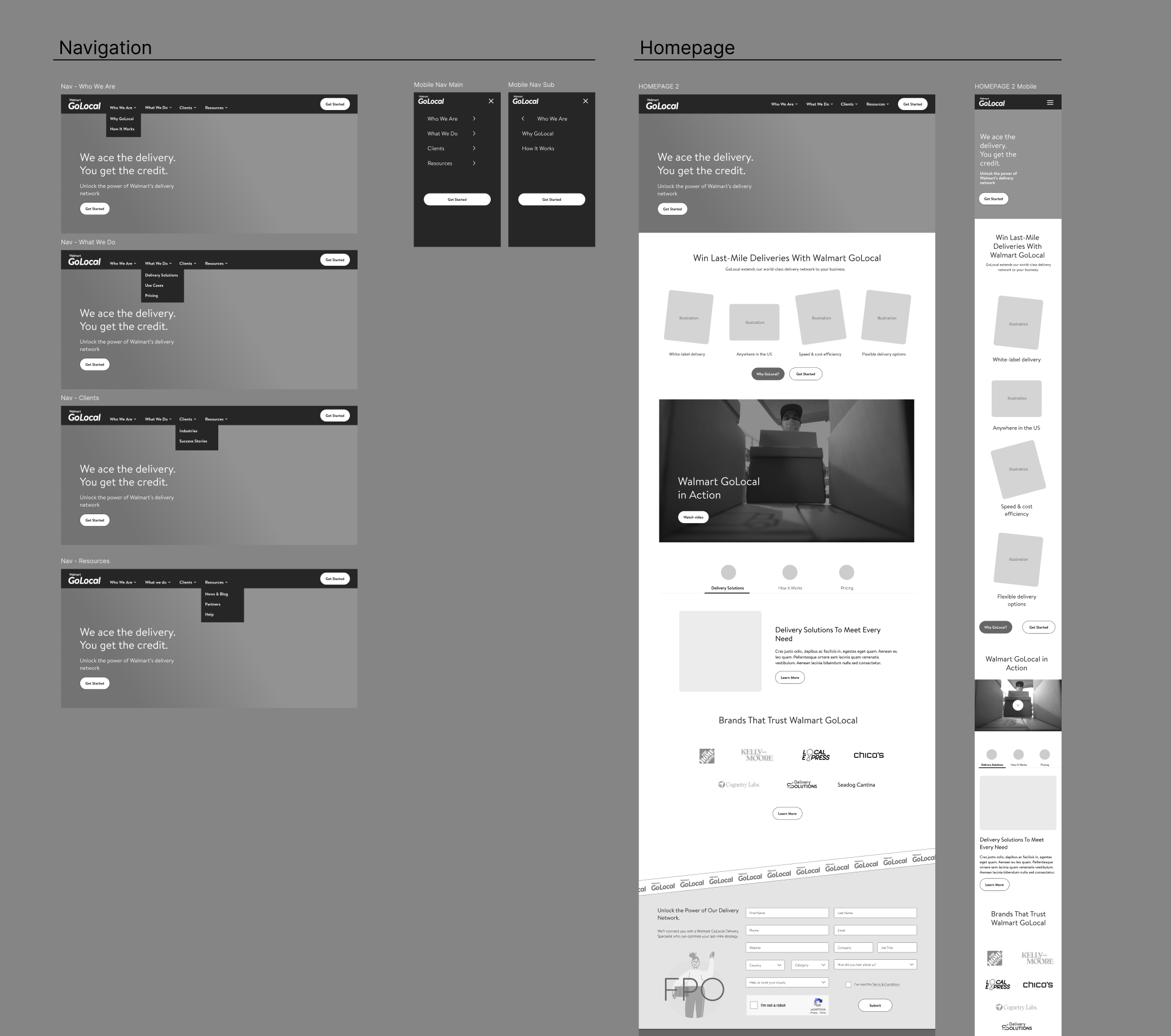
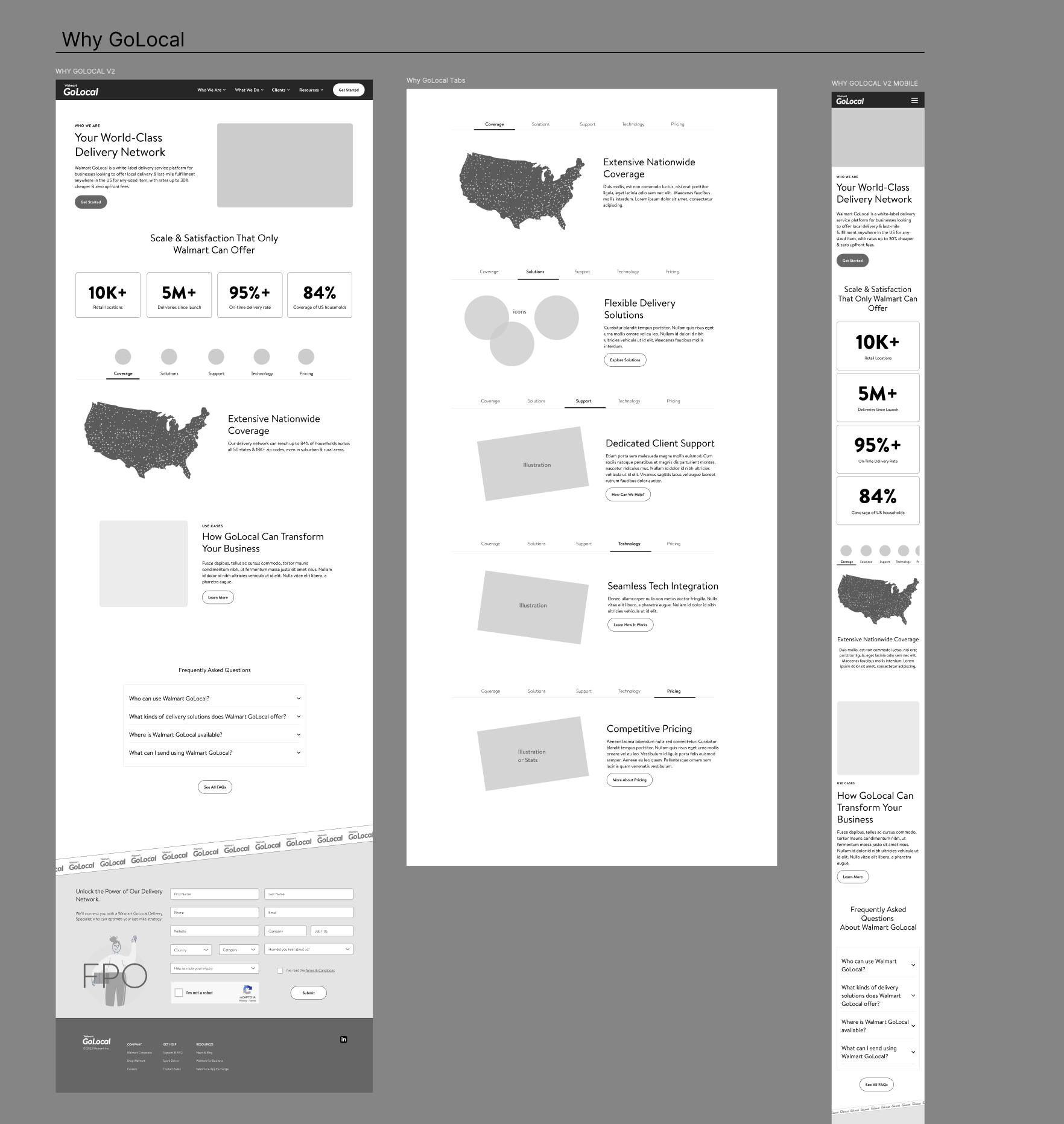
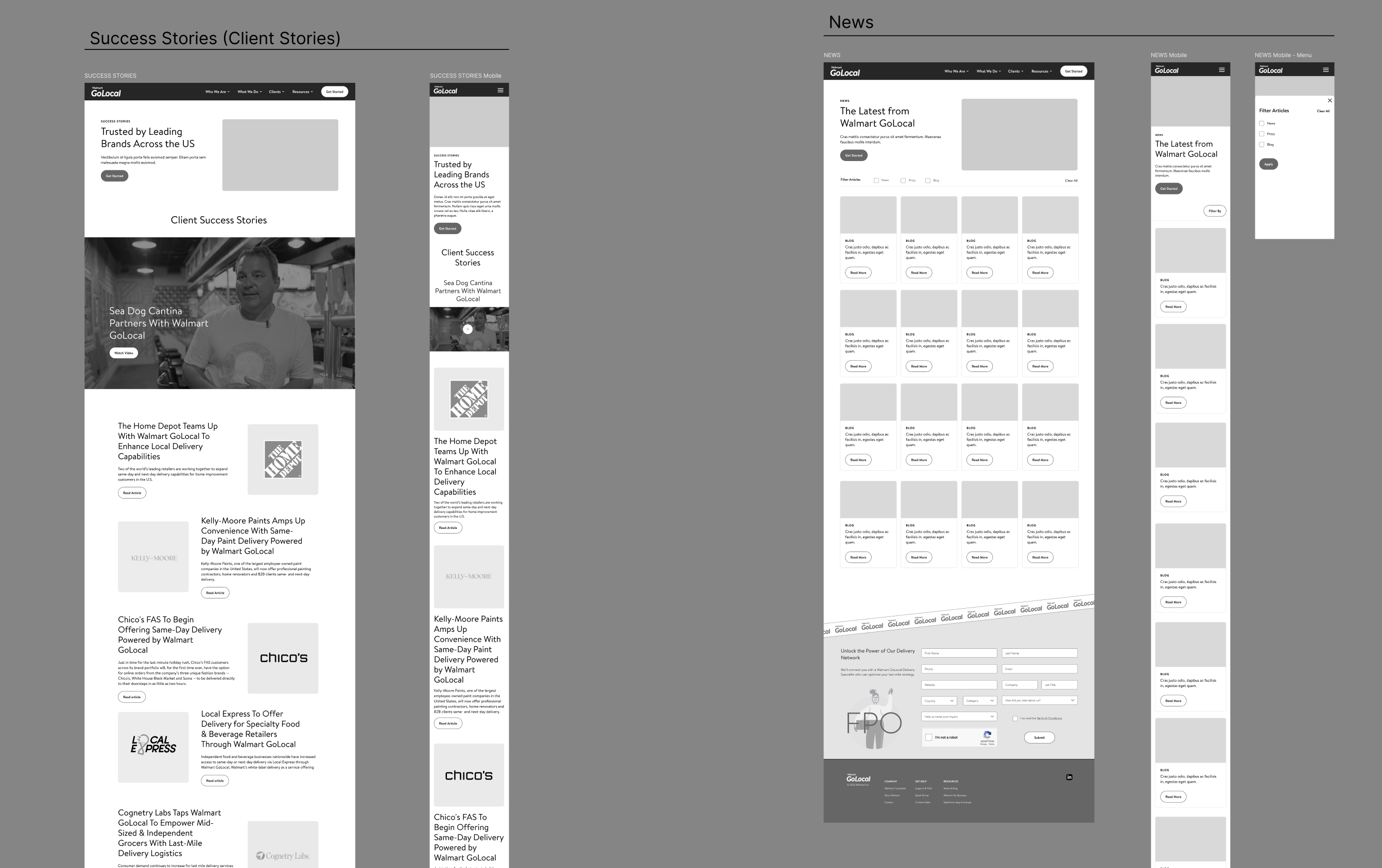
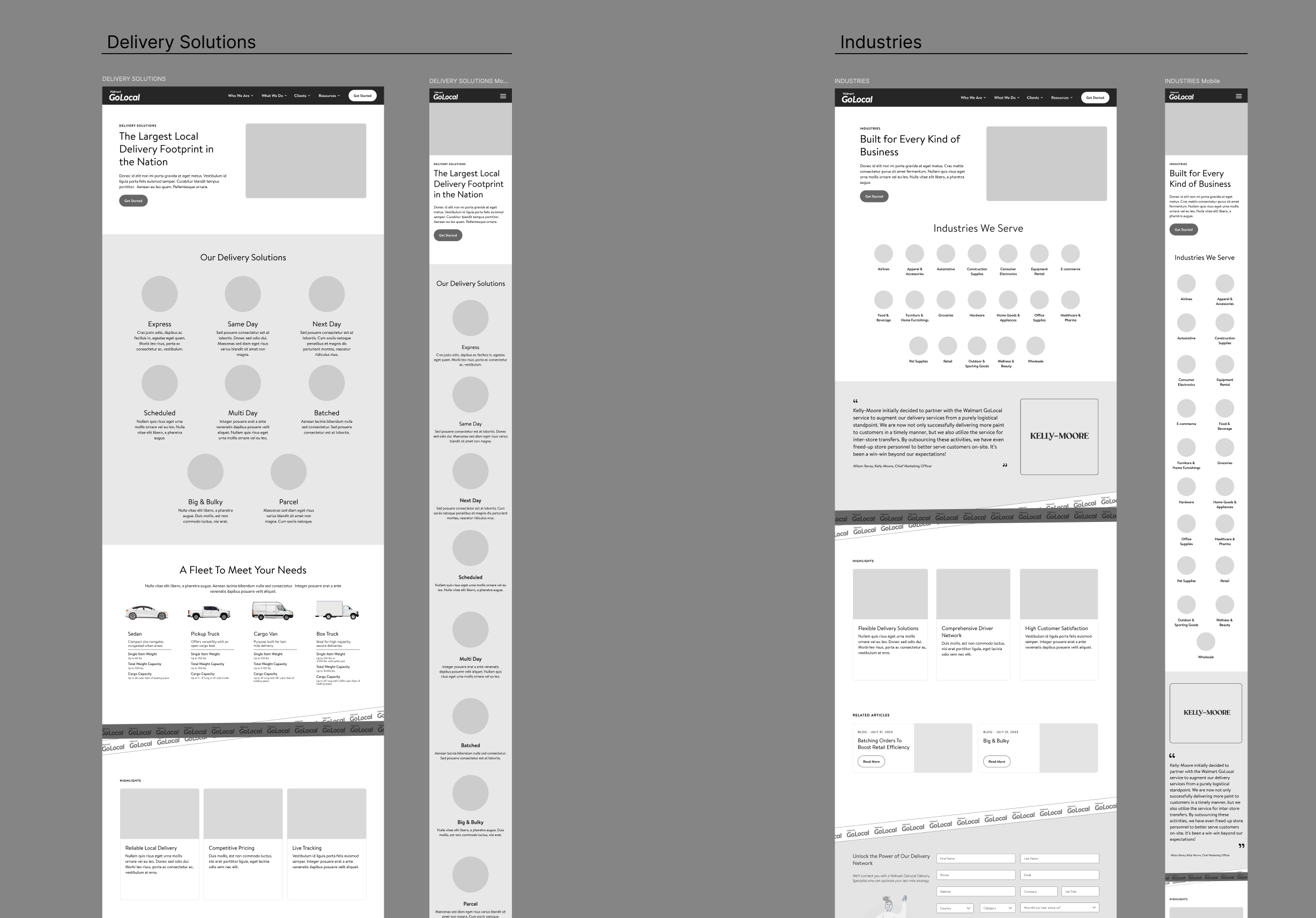
Following the competitive analysis, the focus shifted to architecting the site to support a seamless user journey for diverse business needs. This phase involved creating detailed site architecture maps, which outlined the hierarchical structure of the website's content and functionality. The goal was to ensure intuitive navigation and efficient access to critical information, from service offerings and pricing models to partnership inquiries and technical integration details.
Diving Deeper: The Wireframing Process for Walmart GoLocal
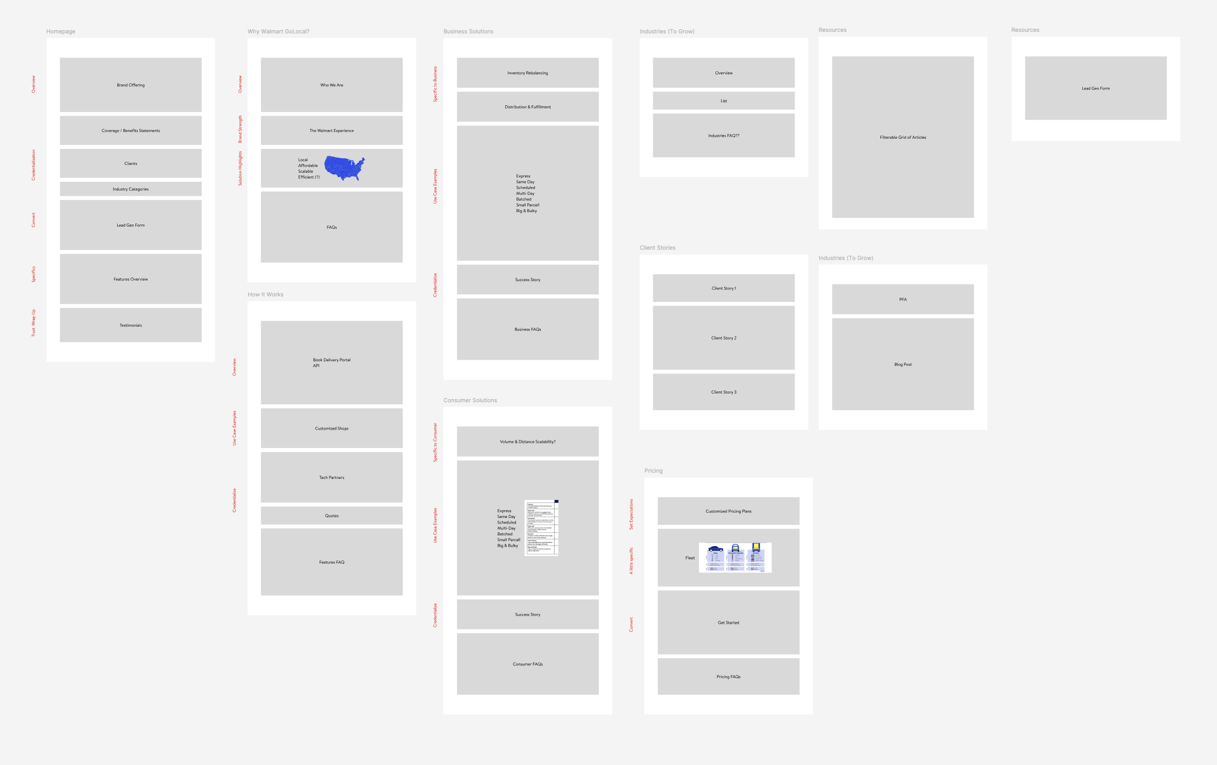
The wireframing phase for the Walmart GoLocal website was a critical juncture where abstract ideas began to take concrete form. Following the extensive site architecture mapping, which defined the hierarchical structure and content flow, I transitioned to creating low-fidelity wireframes for each key page. This wasn't about aesthetics; it was about functionality, content prioritization, and user flow. In Figma, I meticulously sketched out the placement of essential elements: navigation menus, hero sections, call-to-action buttons, information modules, and form fields. For instance, the homepage wireframe focused on clearly communicating the value proposition and guiding users to explore specific service offerings, while the "How it Works" section emphasized a step-by-step visual narrative. Each wireframe served as a blueprint, allowing stakeholders to visualize the user's journey through the site, identify potential roadblocks in information access, and provide early feedback on content hierarchy and interaction patterns.
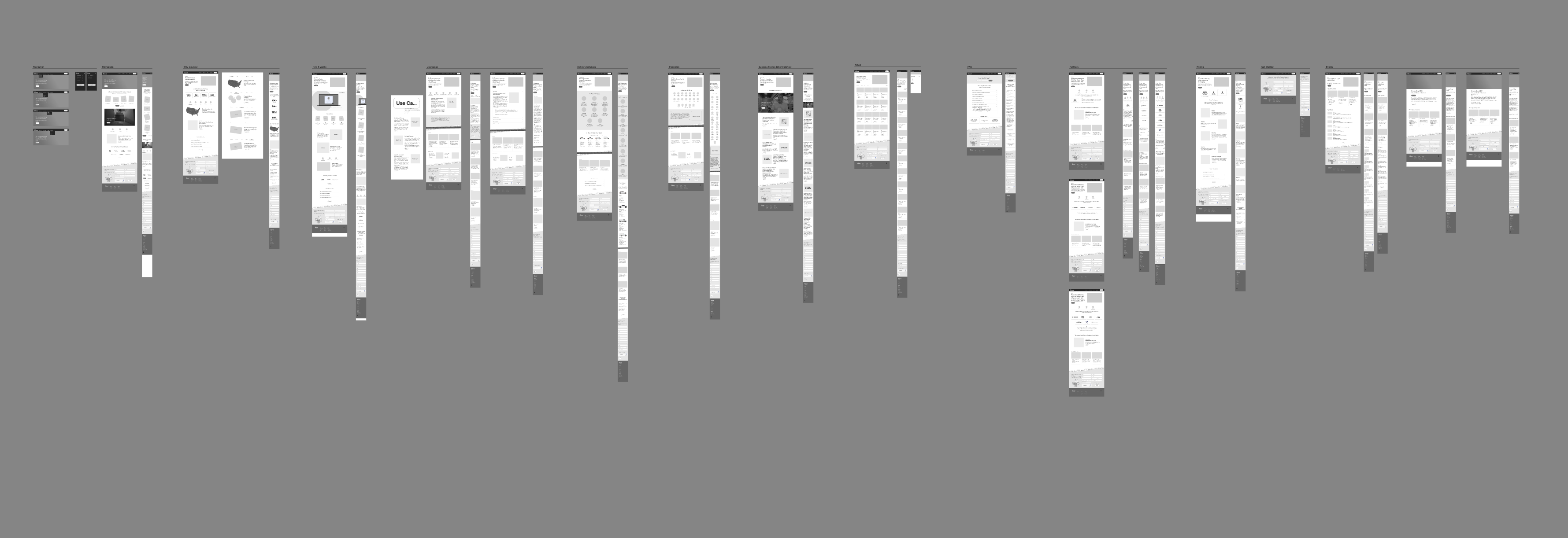
This iterative process, involving frequent reviews and revisions based on stakeholder input, ensured that the final design would be intuitive, efficient, and aligned with both business objectives and user expectations.